Categoría: SwiftUI

  • Protect sensitive information in SwiftUI

    Protect sensitive information in SwiftUI

    The goal of this post is to present some techniques for obfuscating or preventing easy access to highly sensitive information, such as account or credit card numbers.

    Allow copy

    The first thing to clarify is which pieces of information can be copied and which cannot. This behavior is controlled by the .textSelection() modifier.

    struct SensitiveCard: View {
        let title: String
        let primary: String
        let secondary: String
        let icon: String
        let isSelectable: Bool
    
        var body: some View {
            VStack(alignment: .leading, spacing: 12) {
                HStack(spacing: 12) {
                    Image(systemName: icon)
                        .font(.title2)
                        .padding(10)
                        .background(.ultraThinMaterial, in: RoundedRectangle(cornerRadius: 14))
                    Text(title)
                        .font(.title3.weight(.semibold))
                    Spacer()
                }
                Text(primary)
                    .font(.system(.title2, design: .monospaced).weight(.semibold))
                    .conditionalTextSelection(isSelectable)
                Text(secondary)
                    .font(.subheadline)
                    .foregroundStyle(.secondary)
            }
            .padding(18)
            .background(
                RoundedRectangle(cornerRadius: 22, style: .continuous)
                    .fill(.regularMaterial)
                    .shadow(radius: 12, y: 6)
            )
        }
    }
    
    
    struct ConditionalTextSelection: ViewModifier {
        let enable: Bool
        
        func body(content: Content) -> some View {
            if enable {
                content.textSelection(.enabled)
            } else {
                content
            }
        }
    }
    
    extension View {
        func conditionalTextSelection(_ enable: Bool) -> some View {
            self.modifier(ConditionalTextSelection(enable: enable))
        }
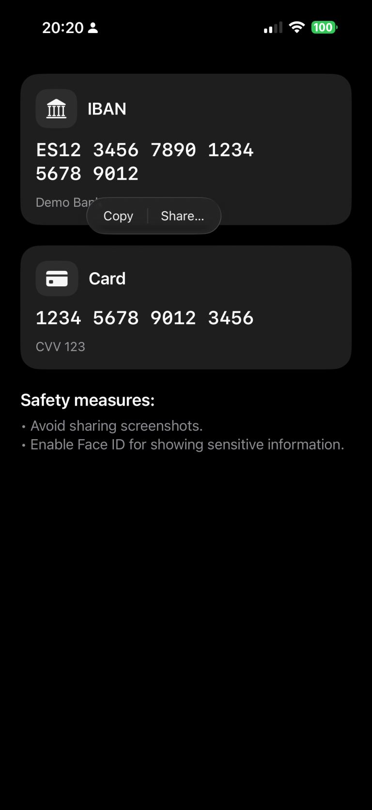
    }

    In this example, we’ve chosen to make the IBAN copyable, while the card number remains restricted.

    struct ContentView: View {
        @State private var cardNumber = "1234 5678 9012 3456"
        @State private var cvv = "123"
        @State private var iban = "ES12 3456 7890 1234 5678 9012"
        @State private var textSelectability: TextSelectability = .disabled
    
        var body: some View {
            ScrollView {
                VStack(alignment: .leading, spacing: 24) {
                    
                    SensitiveCard(title: "IBAN",
                                  primary: iban,
                                  secondary: "Demo Bank",
                                  icon: "building.columns.fill",
                                  isSelectable: true)
                    
                    SensitiveCard(title: "Card",
                                  primary: cardNumber,
                                  secondary: "CVV \(cvv)",
                                  icon: "creditcard.fill",
                                  isSelectable: false)
    
                    VStack(alignment: .leading, spacing: 8) {
                        Text("Safety measures:")
                            .font(.title3.bold())
                        Text("• Avoid sharing screenshots.\n• Enable Face ID for showing sensitive information.")
                            .foregroundStyle(.secondary)
                    }
                }
                .padding(24)
            }
        }
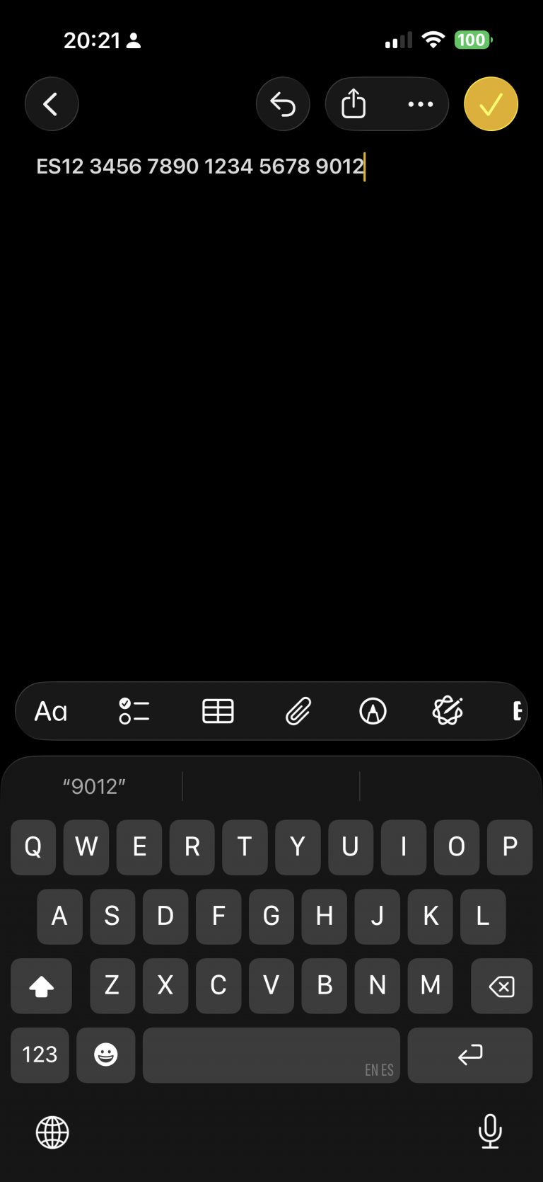
    }

    Run the app and long-press the IBAN code. A contextual pop-up will appear — select “Copy.” Then switch to the Notes app and paste it. You’ll notice that the same operation cannot be performed with the card information.

    Privacy button

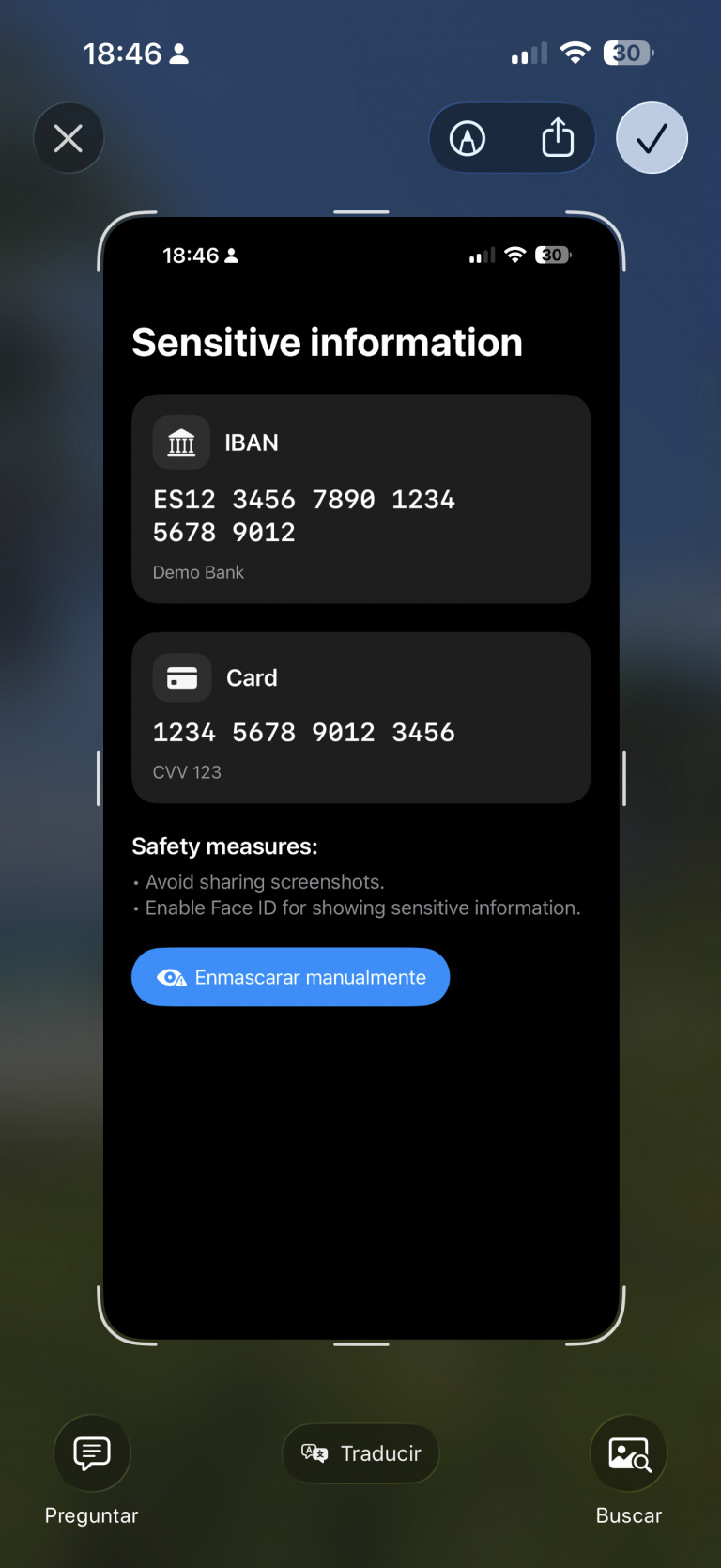
    A measure that can help build user trust is to provide a button that hides sensitive information:

    import SwiftUI
    
    struct ContentView: View {
        .....
        var body: some View {
            ScrollView {
                VStack(alignment: .leading, spacing: 24) {
                    ....
                    Button {
                        // Ejemplo: regenerar/limpiar datos
                        cardNumber = "•••• •••• •••• ••••"
                        cvv = "•••"
                        iban = "ES•• •••• •••• •••• •••• ••••"
                    } label: {
                        Label("Mask manually", systemImage: "eye.trianglebadge.exclamationmark.fill")
                    }
                    .buttonStyle(.borderedProminent)
                    .controlSize(.large)
                }
                .padding(24)
            }
        }
    }

    When changes are deployed:

    review

    Detect app activity

    An alternative to using a button, or a complementary feature, is detecting changes in the app’s activity — for example, when the app is moved to the background:

    import SwiftUI
    import UIKit
    
    struct ContentView: View {
        @Environment(\.scenePhase) private var scenePhase
        @State private var privacyMask = false
    ...
    
        var body: some View {
            ProtectedView {
                SensitiveView(hidden: $showScreenshotAlert)
            }
            .blur(radius: privacyMask ? 28 : 0)
            .overlay {
                if privacyMask {
                    ZStack {
                        Color.black.opacity(0.6).ignoresSafeArea()
                        VStack(spacing: 12) {
                            Image(systemName: "eye.slash.fill")
                                .font(.system(size: 36, weight: .semibold))
                            Text("Content hidden whilst app is not active")
                                .multilineTextAlignment(.center)
                                .font(.headline)
                        }
                        .foregroundColor(.white)
                        .padding()
                    }
                    .accessibilityHidden(true)
                }
            }
            .onChange(of: scenePhase) { phase in
                privacyMask = (phase != .active)
            }
            ...
    }

    Deploy and move app to background:

    review2

    Detect screenshot action

    An important point I discovered during this investigation is that, although the app can detect when a screenshot is taken — which sounds good — the screenshot is still captured anyway.

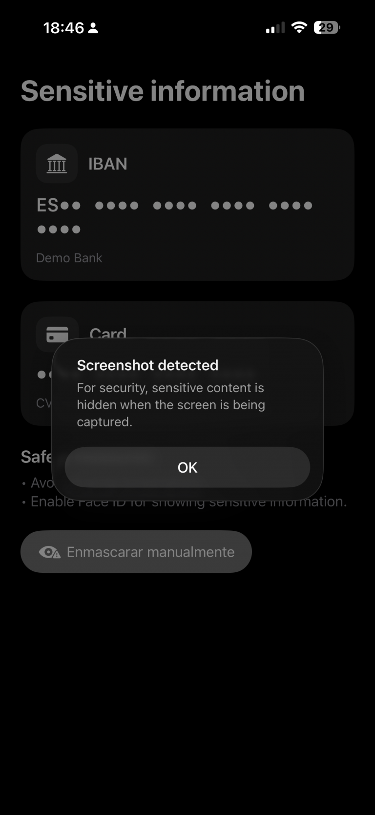
    My recommendation in that case would be to invalidate or regenerate the information if temporary keys are involved. Depending on the scenario, you could also notify the backend services that a screenshot has been taken.

    The code for detecting a screenshot is as follows:

    struct ContentView: View {
    ...
        @State private var showScreenshotAlert = false
    
        var body: some View {
            ProtectedView {
                SensitiveView(hidden: $showScreenshotAlert)
            }
           ...
            .onReceive(NotificationCenter.default.publisher(
                for: UIApplication.userDidTakeScreenshotNotification)) { _ in
                    showScreenshotAlert = true
                }
            .alert("Screenshot detected",
                   isPresented: $showScreenshotAlert) {
                Button("OK", role: .cancel) {}
            } message: {
                Text("For security, sensitive content is hidden when the screen is being captured.")
            }
        }
    }

    Ofuscate on Recording screen

    The final measure is to apply obfuscation when a screen recording is in progress:

    struct ProtectedView<Content: View>: View {
        @State private var isCaptured = UIScreen.main.isCaptured
        @ViewBuilder var content: () -> Content
    
        var body: some View {
            content()
                .blur(radius: isCaptured ? 25 : 0)
                .overlay {
                    if isCaptured {
                        ZStack {
                            Color.black.opacity(0.65).ignoresSafeArea()
                            VStack(spacing: 12) {
                                Image(systemName: "lock.fill")
                                    .font(.system(size: 32, weight: .bold))
                                Text(String(localized: "protected.overlay.title",
                                            defaultValue: "Content hidden while the screen is being captured"))
                                    .multilineTextAlignment(.center)
                                    .font(.headline)
                                    .padding(.horizontal)
                            }
                            .foregroundColor(.white)
                        }
                        .accessibilityHidden(true)
                    }
                }
                .onReceive(NotificationCenter.default.publisher(
                    for: UIScreen.capturedDidChangeNotification)) { _ in
                        isCaptured = UIScreen.main.isCaptured
                    }
        }
    }

    When a screen recording session is active and the user switches to our privacy app, the app detects the recording and can respond by displaying an overlay.

    recording

    Conclusions

    It’s not possible to achieve complete protection against data forgery or privacy breaches, but the more countermeasures you apply, the better your security becomes. That’s what I wanted to demonstrate in this post.

    You can find the source code for this example in the following GitHub repository.

    References

  • Visual Accessibilty in iOS

    Visual Accessibilty in iOS

    Accessibility in iOS apps is a powerful way to highlight the importance of inclusive design while showcasing the robust accessibility tools Apple provides, such as VoiceOver, Dynamic Type, and Switch Control. It not only helps fellow developers understand how to create apps that are usable by everyone, including people with disabilities, but also demonstrates professionalism, empathy, and technical depth. By promoting best practices and raising awareness.

    For this post, we will focus only on visual accessibility aspects. Interaction and media-related topics will be covered in a future post. As we go through this post, I will also provide the project along with the source code used to explain the concepts.

    Accessibility Nutrition Labels

    Accessibility Nutrition Labels in iOS are a developer-driven concept inspired by food nutrition labels, designed to provide a clear, standardized summary of an app’s accessibility features. They help users quickly understand which accessibility tools—such as VoiceOver, Dynamic Type, or Switch Control—are supported, partially supported, or missing, making it easier for individuals with disabilities to choose apps that meet their needs. Though not a native iOS feature, these labels are often included in app. Eventhought accessibility is supported in almost all Apple platforms, some accessibility labels aren’t available check here.

    They can be set at the moment that you upload a new app version on Apple Store.

    Sufficient contrast

    Users can increase or adjust the contrast between text or icons and the background to improve readability. Adequate contrast benefits users with reduced vision due to a disability or temporary condition (e.g., glare from bright sunlight). You can indicate that your app supports “Sufficient Contrast” if its user interface for performing common tasks—including text, buttons, and other controls—meets general contrast guidelines (typically, most text elements should have a contrast ratio of at least 4.5:1). If your app does not meet this minimum contrast ratio by default, it should offer users the ability to customize it according to their needs, either by enabling a high-contrast mode or by applying your own high-contrast color palettes. If your app supports dark mode, be sure to check that the minimum contrast ratio is met in both light and dark modes.

     We have prepared following  following screen, that clearly does not follow this nutrition label:

    Deploy in the simulator and present the screen to audit and open Accesibility Inspector:

    Screenshot

    Deploy in the simulator and present the screen to audit and open Accesibility Inspector, select simulator and Run Audit:

    Important point, only are audited visible view layers:

    Buid and run on a simulator for cheking that all is working fine:

    Dark mode

    Dark Mode in SwiftUI is a user interface style that uses a darker color palette to reduce eye strain and improve visibility in low-light environments. SwiftUI automatically supports Dark Mode by adapting system colors like .primary, .background, and .label based on the user’s system settings. You can customize your UI to respond to Dark Mode using the @Environment(\.colorScheme) property.

    Simulator Screenshot - iPhone 16 Pro - 2025-07-19 at 08.43.32
    Simulator Screenshot - iPhone 16 Pro - 2025-07-19 at 08.43.41

    We’ve designed our app to support Dark Mode, but to ensure full compatibility, we’ll walk through some common tasks. We’ll also test the app with Smart Invert enabled—an accessibility feature that reverses interface colors.

    Simulator Screenshot - iPhone 16 Pro - 2025-07-19 at 12.24.42
    Simulator Screenshot - iPhone 16 Pro - 2025-07-19 at 12.25.15

    Once smart invert is activated all colors are set in their oposite color. This is something that we to have to avoid in some components of our app such as images.

                        AsyncImage(url: URL(string: "https://www.barcelo.com/guia-turismo/wp-content/uploads/2022/10/yakarta-monte-bromo-pal.jpg")) { image in
                             image
                                 .resizable()
                                 .scaledToFit()
                                 .frame(width: 300, height: 200)
                                 .cornerRadius(12)
                                 .shadow(radius: 10)
                         } placeholder: {
                             ProgressView()
                                 .frame(width: 300, height: 200)
                         }
                         .accessibilityIgnoresInvertColors(isDarkMode)

    In case of images or videos we have to avoid color inversion, we can make this happen by adding accessibilityIgnoreInvertColors modifier.

    Simulator Screenshot - iPhone 16 Pro - 2025-07-19 at 08.43.32
    Simulator Screenshot - iPhone 16 Pro - 2025-07-19 at 08.43.41

    It’s important to verify that media elements, like images and videos, aren’t unintentionally inverted. Once we’ve confirmed that our app maintains a predominantly dark background, we can confidently include Dark Interface in our Accessibility Nutrition Labels.

    Larger Text

    In Swift, «Larger Text» under Accessibility refers to iOS’s Dynamic Type system, which allows users to increase text size across apps for better readability. When building a nutrition label UI, developers should support these settings by using Dynamic Type-compatible fonts (like .body, .title, etc.), enabling automatic font scaling (adjustsFontForContentSizeCategory in UIKit or .dynamicTypeSize(...) in SwiftUI), and ensuring layouts adapt properly to larger sizes. This ensures the nutrition label remains readable and accessible to users with visual impairments, complying with best practices for inclusive app design.

    You can increase dynamic type in simulator in two ways, first one is by using accesibilty inspector, second one is by opening device Settings, Accessibilty, Display & Text Size, Larger text:

    Simulator Screenshot - iPhone 16 Pro - 2025-07-19 at 13.00.31

    When se set the text to largest size we observe following:

    simulator_screenshot_F5937212-D584-449C-AE40-BFE3BEE486A3

    Only navigation title is being resized the rest of the content keeps the same size, this is not so much accessible!.

    When we execute accesibilty inspectoron this screen also complains.

    By replacing fixed font size by the type of font (.largeTitle, .title, .title2, .title3, .headline, .subheadline, .body, .callout, .footnote and .caption ). Remve also any frame fixed size that could cut any contained text. 

     func contentAccessible() -> some View {
            VStack(alignment: .leading, spacing: 8) {
                Text("Nutrition Facts")
                    .font(.title)
                    .bold()
                    .accessibilityAddTraits(.isHeader)
    
                Divider()
    
                HStack {
                    Text("Calories")
                        .font(.body)
                    Spacer()
                    Text("200")
                        .font(.body)
                }
    
                HStack {
                    Text("Total Fat")
                        .font(.body)
                    Spacer()
                    Text("8g")
                        .font(.body)
                }
    
                HStack {
                    Text("Sodium")
                        .font(.body)
                    Spacer()
                    Text("150mg")
                        .font(.body)
                }
            }
            .padding()
            .navigationTitle("Larger Text")
        }
    simulator_screenshot_80105F6D-0B6A-4899-ACEF-4CE44221E330

    We can observe how the view behaves when Dynamic Type is adjusted from the minimum to the maximum size. Notice that when the text «Nutrition Facts» no longer fits horizontally, it wraps onto two lines. The device is limited in horizontal space, but never vertically, as vertical overflow is handled by implementing a scroll view.

    Differentiate without color alone

    Let’s discuss color in design. It’s important to remember that not everyone perceives color the same way. Many apps rely on color—like red for errors or green for success—to convey status or meaning. However, users with color blindness might not be able to distinguish these cues. To ensure accessibility, always pair color with additional elements such as icons or text to communicate important information clearly to all users.

    Accessibility inspector, and also any color blinded person, will complain. For fixing use any shape or icon, apart from the color.l

    Simulator Screenshot - iPhone 16 Pro - 2025-07-19 at 16.59.40
    Simulator Screenshot - iPhone 16 Pro - 2025-07-19 at 16.59.46

    Reduced motion

    Motion can enhance the user experience of an app. However, certain types of motion—such as zooming, rotating, or peripheral movement—can cause dizziness or nausea for people with vestibular sensitivity. If your app includes these kinds of motion effects, make them optional or provide alternative animations.

    Lets review the code:

    struct ReducedMotionView: View {
        @Environment(\.accessibilityReduceMotion) var reduceMotion
        @State private var spin = false
        @State private var scale: CGFloat = 1.0
        @State private var moveOffset: CGFloat = -200
    
        var body: some View {
            NavigationView {
                ZStack {
                    // Background rotating spiral
                    Circle()
                        .strokeBorder(Color.purple, lineWidth: 10)
                        .frame(width: 300, height: 300)
                        .rotationEffect(.degrees(spin ? 360 : 0))
                        .animation(reduceMotion ? nil : .linear(duration: 3).repeatForever(autoreverses: false), value: spin)
    
                    // Scaling and bouncing circle
                    Circle()
                        .fill(Color.orange)
                        .frame(width: 100, height: 100)
                        .scaleEffect(scale)
                        .offset(x: reduceMotion ? 0 : moveOffset)
                        .animation(reduceMotion ? nil : .easeInOut(duration: 1).repeatForever(autoreverses: true), value: scale)
                }
                .onAppear {
                    if !reduceMotion {
                        spin = true
                        scale = 1.5
                        moveOffset = 200
                    }
                }
                .padding()
                .overlay(
                    Text(reduceMotion ? "Reduce Motion Enabled" : "Extreme Motion Enabled")
                        .font(.headline)
                        .padding()
                        .background(Color.black.opacity(0.7))
                        .foregroundColor(.white)
                        .cornerRadius(12)
                        .padding(),
                    alignment: .top
                )
            }
            .navigationTitle("Reduced motion")
        }
    }

    The ReducedMotionView SwiftUI view creates a visual demonstration of motion effects that adapts based on the user’s accessibility setting for reduced motion. It displays a rotating purple spiral in the background and an orange circle in the foreground that scales and moves horizontally. When the user has Reduce Motion disabled, the spiral continuously rotates and the orange circle animates back and forth while scaling; when Reduce Motion is enabled, all animations are disabled and the shapes remain static. A label at the top dynamically indicates whether motion effects are enabled or reduced, providing a clear visual contrast for accessibility testing.

    Reduce Motion accessibility is not about removing animations from your app, but disable them when user has disabled Reduce Motion device setting.


    Pending

    Yes, this post is not complete yet. There are two families of Nutrition accessibility labels: Interaction and Media. I will cover them in a future post.

    Conclusions

    Apart from the benefits that accessibility provides to a significant group of people, let’s not forget that disabilities are diverse, and as we grow older, sooner or later we will likely need to use accessibility features ourselves. Even people without disabilities may, at some point, need to focus on information under challenging conditions—like poor weather—which can make interaction more difficult. It’s clear that this will affect us as iOS developers in how we design and implement user interfaces in our apps.

    You can find source code that we have used for conducting this post in following GitHub repository.

    References