Categoría: SwiftUI

  • Customized TabBar in SwiftUI

    Customized TabBar in SwiftUI

    Building a tab bar in SwiftUI often starts with the simplicity of TabView, but real-world apps quickly demand more flexibility than the default component provides. In this post, we’ll take a practical, step-by-step journey from the standard implementation to a fully customized, animated tab bar—exploring how to progressively enhance styling, restructure layout, and ultimately replace built-in behavior with a state-driven solution. Along the way, we’ll touch on core SwiftUI concepts like data flow, view composition, and animation, using a familiar UI pattern to bridge the gap between basic usage and building polished, production-ready interfaces.

    Basic SwiftUI TabBar

    The minimum code for implementening a TabBar is just following:

    struct ContentView: View {
        var body: some View {
            TabView {
                MainScrollStoryView()
                    .tabItem {
                        Label("Home", systemImage: "doc.text.fill")
                    }
                
                ProfileView()
                    .tabItem {
                        Label("Profile", systemImage: "person.circle.fill")
                    }
    
                SettingsView()
                    .tabItem {
                        Label("Settings", systemImage: "gearshape.fill")
                    }
            }
            .accentColor(.blue)
        }
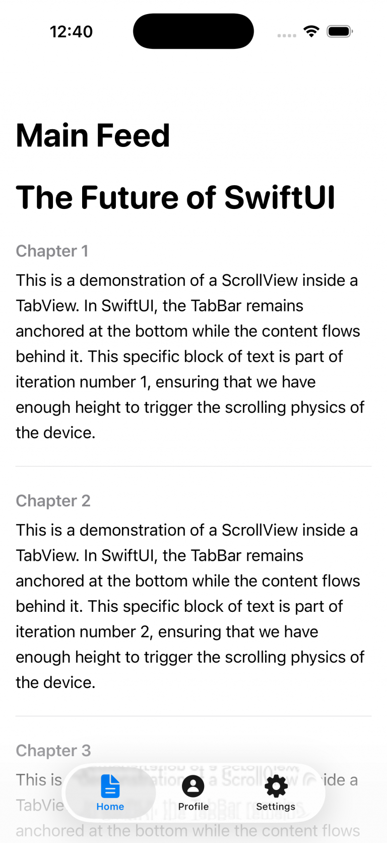
    }

    It defines a tab-based interface in SwiftUI where a TabView presents three sections—Home, Profile, and Settings—each linked to its own view (MainScrollStoryView, ProfileView, and SettingsView); every tab is configured with a Label combining a title and an SF Symbol icon, and the .accentColor(.blue) modifier sets the active tab’s tint color to blue, so when users tap a tab, the corresponding view is displayed while the selected tab is visually highlighted.

    This is one of the views attached to one of the tabs:


    struct MainScrollStoryView: View {
        var body: some View {
            NavigationStack {
                ScrollView {
                    VStack(alignment: .leading, spacing: 25) {
                        Text("The Future of SwiftUI")
                            .font(.system(size: 34, weight: .bold, design: .rounded))
                        ForEach(1...25, id: \.self) { index in
                            VStack(alignment: .leading, spacing: 10) {
                                Text("Chapter \(index)")
                                    .font(.headline)
                                    .foregroundColor(.secondary)
                                
                                Text("This is a demonstration of a ScrollView inside a TabView. In SwiftUI, the TabBar remains anchored at the bottom while the content flows behind it. This specific block of text is part of iteration number \(index), ensuring that we have enough height to trigger the scrolling physics of the device.")
                                    .font(.body)
                                    .lineSpacing(6)
                            }
                            Divider()
                        }
                    }
                    .padding()
                }
                .navigationTitle("Main Feed")
            }
        }
    }

    As in UIKit, there’s no issue embedding one container controller (e.g., a NavigationStack) inside another container controller (such as a TabBar). And finally the result:


    Adapt TabBar to your System Dessign

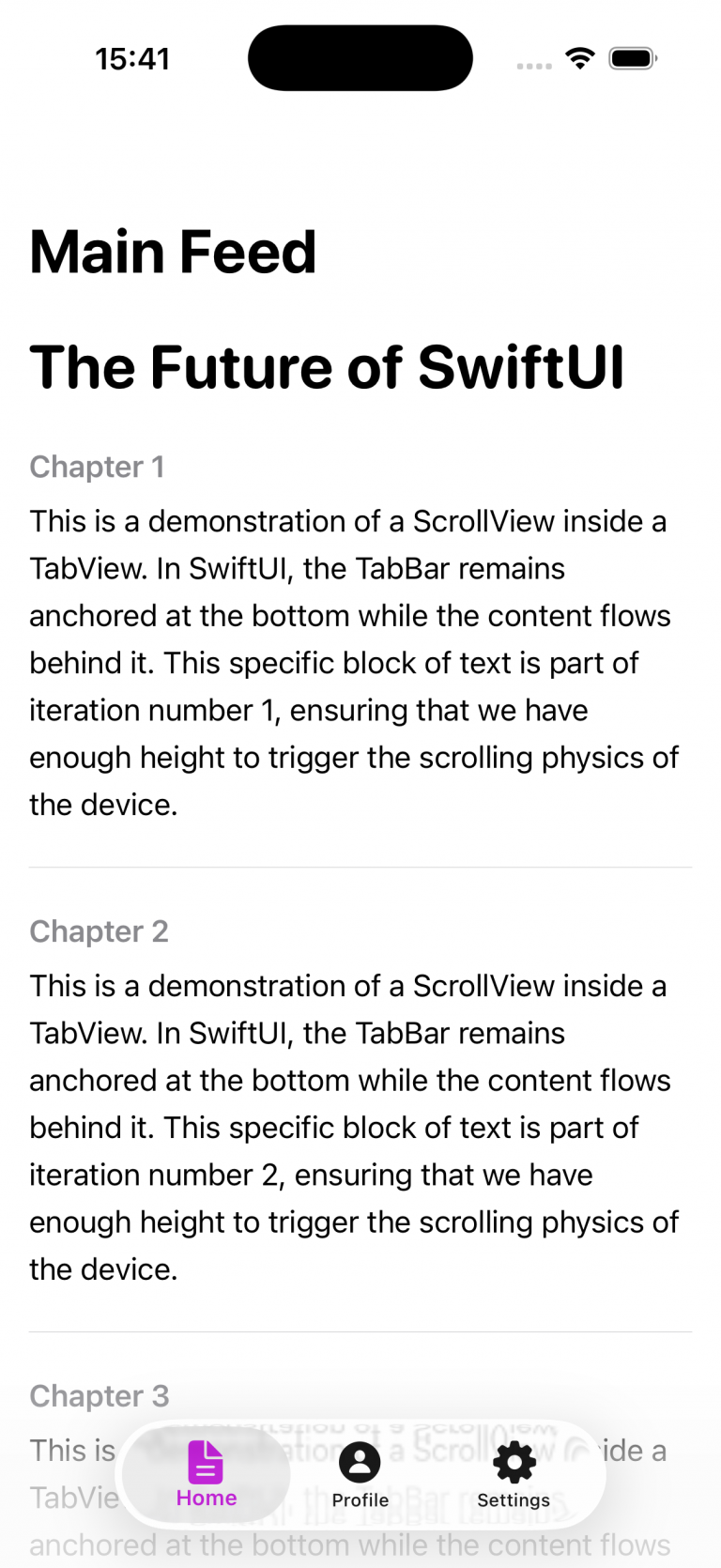
    It’s quite common, especially on projects of a certain scale, to work with a UX/UI team that defines and governs the application’s visual design and user experience. In most of the cases they respect HIG (Human Interface Guidelines), so is just customize basically icons, fonts and colors.

    struct CustomStyledTabView: View {
        init() {
            let appearance = UITabBarAppearance()
            appearance.configureWithOpaqueBackground()
            appearance.backgroundColor = .systemBackground
            
            let selectedAttributes: [NSAttributedString.Key: Any] = [
                .foregroundColor: UIColor.systemPurple,
                .font: UIFont.boldSystemFont(ofSize: 12)
            ]
            
            let normalAttributes: [NSAttributedString.Key: Any] = [
                .foregroundColor: UIColor.gray
            ]
            
            appearance.stackedLayoutAppearance.selected.titleTextAttributes = selectedAttributes
            appearance.stackedLayoutAppearance.selected.iconColor = .systemPurple
            
            appearance.stackedLayoutAppearance.normal.titleTextAttributes = normalAttributes
            appearance.stackedLayoutAppearance.normal.iconColor = .gray
    
            UITabBar.appearance().standardAppearance = appearance
            UITabBar.appearance().scrollEdgeAppearance = appearance
        }
    
        var body: some View {
            TabView {
                MainScrollStoryView()
                    .tabItem {
                        Label("Home", systemImage: "doc.text.fill")
                    }
                ProfileView()
                    .tabItem {
                        Label("Profile", systemImage: "person.circle.fill")
                    }
                
                SettingsView()
                    .tabItem {
                        Label("Settings", systemImage: "gearshape.fill")
                    }
            }
        }
    } 

    This SwiftUI View struct customizes the global appearance of all tab bars in the app by configuring a UITabBarAppearance instance during initialization. It sets an opaque background using the system background color, then defines distinct text and icon styles for selected and unselected tab items—selected items appear in purple with a bold font, while unselected ones are gray. These styling attributes are applied specifically to the standard stacked layout used in bottom tab bars. Finally, the configured appearance is assigned to both the standardAppearance and scrollEdgeAppearance of UITabBar via the UIAppearance proxy, ensuring consistent styling across the entire app.

    Fully customization

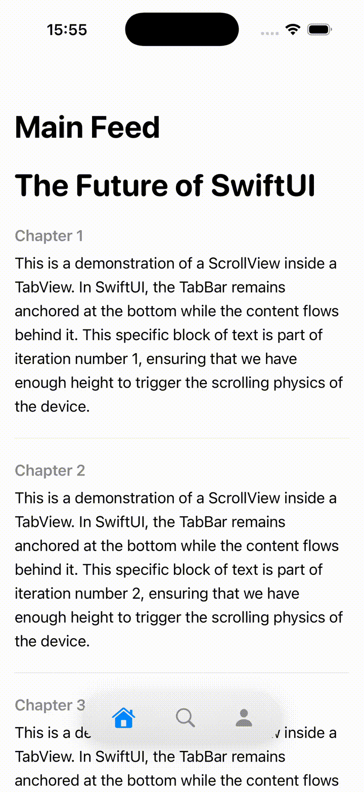
    Sometimes the default customization options provided by the SDK aren’t sufficient, and you need to push beyond them—for example, when you want to introduce additional animations.

    struct FloatingTabBarView: View {
        @State private var selectedTab = 0
        @State private var isTabBarVisible = true
        
        var body: some View {
            ZStack(alignment: .bottom) {
                NavigationStack {
                    MainScrollStoryView()
                    .navigationTitle("Auto-hide Bar")
                    .onScrollGeometryChange(for: CGFloat.self) { geo in
                        geo.contentOffset.y
                    } action: { oldValue, newValue in
                        let scrollingDown = newValue > oldValue
                        let isAtTop = newValue <= 0
                        
                        withAnimation(.easeInOut(duration: 0.3)) {
                            if isAtTop {
                                isTabBarVisible = true
                            } else if scrollingDown {
                                isTabBarVisible = false
                            } else {
                                isTabBarVisible = true
                            }
                        }
                    }
                }
                if isTabBarVisible {
                    CustomBar(selectedTab: $selectedTab)
                        .transition(.move(edge: .bottom).combined(with: .opacity))
                        .zIndex(1)
                }
            }
        }
    }
    
    struct CustomBar: View {
        @Binding var selectedTab: Int
        
        var body: some View {
            HStack(spacing: 40) {
                TabBarButton(index: 0, icon: "house.fill", selectedTab: $selectedTab)
                TabBarButton(index: 1, icon: "magnifyingglass", selectedTab: $selectedTab)
                TabBarButton(index: 2, icon: "person.fill", selectedTab: $selectedTab)
            }
            .padding(.horizontal, 30)
            .padding(.vertical, 15)
            .background(.ultraThinMaterial)
            .clipShape(Capsule())
            .shadow(color: .black.opacity(0.15), radius: 10, y: 5)
            .padding(.bottom, 20)
        }
    }
    
    struct TabBarButton: View {
        let index: Int
        let icon: String
        @Binding var selectedTab: Int
        
        var body: some View {
            Button(action: { selectedTab = index }) {
                Image(systemName: icon)
                    .font(.system(size: 22))
                    .foregroundColor(selectedTab == index ? .blue : .gray)
            }
        }
    }

    This code defines a custom SwiftUI tab bar system that overlays a floating, animated tab bar on top of a scrollable view. The main FloatingTabBarView uses a ZStack to position content and the tab bar, embedding a NavigationStack with a scrollable MainScrollStoryView. It listens to scroll position changes via onScrollGeometryChange, comparing the previous and current vertical offsets to determine scroll direction. Based on this, it toggles the isTabBarVisible state with a smooth animation: the tab bar hides when the user scrolls down, reappears when scrolling up, and stays visible when the content is at the top.

    The CustomBar and TabBarButton components define the visual and interactive behavior of the floating tab bar. CustomBar lays out three tab buttons horizontally inside a capsule-shaped container with a blurred background (ultraThinMaterial) and shadow, giving it a modern floating appearance. Each TabBarButton updates the shared selectedTab binding when tapped and visually reflects its active state by switching icon color between blue (selected) and gray (unselected). The tab bar itself animates in and out using a combined slide-from-bottom and fade transition, creating a polished, dynamic UI effect.

    func combineUsage() {
        NotificationCenter.default.publisher(for: UIApplication.didBecomeActiveNotification)
            .sink { _ in
                print("App active")
            }
            .store(in: &cancellables)
    }
    

    Conclusions

    Across the three examples, we’ve explored how to implement a TabBar, apply basic customization, and extend its behavior beyond the standard capabilities.

    You can find the source code for this example in the following GitHub repository.

    References

  • Protect sensitive information in SwiftUI

    Protect sensitive information in SwiftUI

    The goal of this post is to present some techniques for obfuscating or preventing easy access to highly sensitive information, such as account or credit card numbers.

    Allow copy

    The first thing to clarify is which pieces of information can be copied and which cannot. This behavior is controlled by the .textSelection() modifier.

    struct SensitiveCard: View {
        let title: String
        let primary: String
        let secondary: String
        let icon: String
        let isSelectable: Bool
    
        var body: some View {
            VStack(alignment: .leading, spacing: 12) {
                HStack(spacing: 12) {
                    Image(systemName: icon)
                        .font(.title2)
                        .padding(10)
                        .background(.ultraThinMaterial, in: RoundedRectangle(cornerRadius: 14))
                    Text(title)
                        .font(.title3.weight(.semibold))
                    Spacer()
                }
                Text(primary)
                    .font(.system(.title2, design: .monospaced).weight(.semibold))
                    .conditionalTextSelection(isSelectable)
                Text(secondary)
                    .font(.subheadline)
                    .foregroundStyle(.secondary)
            }
            .padding(18)
            .background(
                RoundedRectangle(cornerRadius: 22, style: .continuous)
                    .fill(.regularMaterial)
                    .shadow(radius: 12, y: 6)
            )
        }
    }
    
    
    struct ConditionalTextSelection: ViewModifier {
        let enable: Bool
        
        func body(content: Content) -> some View {
            if enable {
                content.textSelection(.enabled)
            } else {
                content
            }
        }
    }
    
    extension View {
        func conditionalTextSelection(_ enable: Bool) -> some View {
            self.modifier(ConditionalTextSelection(enable: enable))
        }
    }

    In this example, we’ve chosen to make the IBAN copyable, while the card number remains restricted.

    struct ContentView: View {
        @State private var cardNumber = "1234 5678 9012 3456"
        @State private var cvv = "123"
        @State private var iban = "ES12 3456 7890 1234 5678 9012"
        @State private var textSelectability: TextSelectability = .disabled
    
        var body: some View {
            ScrollView {
                VStack(alignment: .leading, spacing: 24) {
                    
                    SensitiveCard(title: "IBAN",
                                  primary: iban,
                                  secondary: "Demo Bank",
                                  icon: "building.columns.fill",
                                  isSelectable: true)
                    
                    SensitiveCard(title: "Card",
                                  primary: cardNumber,
                                  secondary: "CVV \(cvv)",
                                  icon: "creditcard.fill",
                                  isSelectable: false)
    
                    VStack(alignment: .leading, spacing: 8) {
                        Text("Safety measures:")
                            .font(.title3.bold())
                        Text("• Avoid sharing screenshots.\n• Enable Face ID for showing sensitive information.")
                            .foregroundStyle(.secondary)
                    }
                }
                .padding(24)
            }
        }
    }

    Run the app and long-press the IBAN code. A contextual pop-up will appear — select “Copy.” Then switch to the Notes app and paste it. You’ll notice that the same operation cannot be performed with the card information.

    Privacy button

    A measure that can help build user trust is to provide a button that hides sensitive information:

    import SwiftUI
    
    struct ContentView: View {
        .....
        var body: some View {
            ScrollView {
                VStack(alignment: .leading, spacing: 24) {
                    ....
                    Button {
                        // Ejemplo: regenerar/limpiar datos
                        cardNumber = "•••• •••• •••• ••••"
                        cvv = "•••"
                        iban = "ES•• •••• •••• •••• •••• ••••"
                    } label: {
                        Label("Mask manually", systemImage: "eye.trianglebadge.exclamationmark.fill")
                    }
                    .buttonStyle(.borderedProminent)
                    .controlSize(.large)
                }
                .padding(24)
            }
        }
    }

    When changes are deployed:

    review

    Detect app activity

    An alternative to using a button, or a complementary feature, is detecting changes in the app’s activity — for example, when the app is moved to the background:

    import SwiftUI
    import UIKit
    
    struct ContentView: View {
        @Environment(\.scenePhase) private var scenePhase
        @State private var privacyMask = false
    ...
    
        var body: some View {
            ProtectedView {
                SensitiveView(hidden: $showScreenshotAlert)
            }
            .blur(radius: privacyMask ? 28 : 0)
            .overlay {
                if privacyMask {
                    ZStack {
                        Color.black.opacity(0.6).ignoresSafeArea()
                        VStack(spacing: 12) {
                            Image(systemName: "eye.slash.fill")
                                .font(.system(size: 36, weight: .semibold))
                            Text("Content hidden whilst app is not active")
                                .multilineTextAlignment(.center)
                                .font(.headline)
                        }
                        .foregroundColor(.white)
                        .padding()
                    }
                    .accessibilityHidden(true)
                }
            }
            .onChange(of: scenePhase) { phase in
                privacyMask = (phase != .active)
            }
            ...
    }

    Deploy and move app to background:

    review2

    Detect screenshot action

    An important point I discovered during this investigation is that, although the app can detect when a screenshot is taken — which sounds good — the screenshot is still captured anyway.

    My recommendation in that case would be to invalidate or regenerate the information if temporary keys are involved. Depending on the scenario, you could also notify the backend services that a screenshot has been taken.

    The code for detecting a screenshot is as follows:

    struct ContentView: View {
    ...
        @State private var showScreenshotAlert = false
    
        var body: some View {
            ProtectedView {
                SensitiveView(hidden: $showScreenshotAlert)
            }
           ...
            .onReceive(NotificationCenter.default.publisher(
                for: UIApplication.userDidTakeScreenshotNotification)) { _ in
                    showScreenshotAlert = true
                }
            .alert("Screenshot detected",
                   isPresented: $showScreenshotAlert) {
                Button("OK", role: .cancel) {}
            } message: {
                Text("For security, sensitive content is hidden when the screen is being captured.")
            }
        }
    }

    Ofuscate on Recording screen

    The final measure is to apply obfuscation when a screen recording is in progress:

    struct ProtectedView<Content: View>: View {
        @State private var isCaptured = UIScreen.main.isCaptured
        @ViewBuilder var content: () -> Content
    
        var body: some View {
            content()
                .blur(radius: isCaptured ? 25 : 0)
                .overlay {
                    if isCaptured {
                        ZStack {
                            Color.black.opacity(0.65).ignoresSafeArea()
                            VStack(spacing: 12) {
                                Image(systemName: "lock.fill")
                                    .font(.system(size: 32, weight: .bold))
                                Text(String(localized: "protected.overlay.title",
                                            defaultValue: "Content hidden while the screen is being captured"))
                                    .multilineTextAlignment(.center)
                                    .font(.headline)
                                    .padding(.horizontal)
                            }
                            .foregroundColor(.white)
                        }
                        .accessibilityHidden(true)
                    }
                }
                .onReceive(NotificationCenter.default.publisher(
                    for: UIScreen.capturedDidChangeNotification)) { _ in
                        isCaptured = UIScreen.main.isCaptured
                    }
        }
    }

    When a screen recording session is active and the user switches to our privacy app, the app detects the recording and can respond by displaying an overlay.

    recording

    Conclusions

    It’s not possible to achieve complete protection against data forgery or privacy breaches, but the more countermeasures you apply, the better your security becomes. That’s what I wanted to demonstrate in this post.

    You can find the source code for this example in the following GitHub repository.

    References

  • Visual Accessibilty in iOS

    Visual Accessibilty in iOS

    Accessibility in iOS apps is a powerful way to highlight the importance of inclusive design while showcasing the robust accessibility tools Apple provides, such as VoiceOver, Dynamic Type, and Switch Control. It not only helps fellow developers understand how to create apps that are usable by everyone, including people with disabilities, but also demonstrates professionalism, empathy, and technical depth. By promoting best practices and raising awareness.

    For this post, we will focus only on visual accessibility aspects. Interaction and media-related topics will be covered in a future post. As we go through this post, I will also provide the project along with the source code used to explain the concepts.

    Accessibility Nutrition Labels

    Accessibility Nutrition Labels in iOS are a developer-driven concept inspired by food nutrition labels, designed to provide a clear, standardized summary of an app’s accessibility features. They help users quickly understand which accessibility tools—such as VoiceOver, Dynamic Type, or Switch Control—are supported, partially supported, or missing, making it easier for individuals with disabilities to choose apps that meet their needs. Though not a native iOS feature, these labels are often included in app. Eventhought accessibility is supported in almost all Apple platforms, some accessibility labels aren’t available check here.

    They can be set at the moment that you upload a new app version on Apple Store.

    Sufficient contrast

    Users can increase or adjust the contrast between text or icons and the background to improve readability. Adequate contrast benefits users with reduced vision due to a disability or temporary condition (e.g., glare from bright sunlight). You can indicate that your app supports “Sufficient Contrast” if its user interface for performing common tasks—including text, buttons, and other controls—meets general contrast guidelines (typically, most text elements should have a contrast ratio of at least 4.5:1). If your app does not meet this minimum contrast ratio by default, it should offer users the ability to customize it according to their needs, either by enabling a high-contrast mode or by applying your own high-contrast color palettes. If your app supports dark mode, be sure to check that the minimum contrast ratio is met in both light and dark modes.

     We have prepared following  following screen, that clearly does not follow this nutrition label:

    Deploy in the simulator and present the screen to audit and open Accesibility Inspector:

    Screenshot

    Deploy in the simulator and present the screen to audit and open Accesibility Inspector, select simulator and Run Audit:

    Important point, only are audited visible view layers:

    Buid and run on a simulator for cheking that all is working fine:

    Dark mode

    Dark Mode in SwiftUI is a user interface style that uses a darker color palette to reduce eye strain and improve visibility in low-light environments. SwiftUI automatically supports Dark Mode by adapting system colors like .primary, .background, and .label based on the user’s system settings. You can customize your UI to respond to Dark Mode using the @Environment(\.colorScheme) property.

    Simulator Screenshot - iPhone 16 Pro - 2025-07-19 at 08.43.32
    Simulator Screenshot - iPhone 16 Pro - 2025-07-19 at 08.43.41

    We’ve designed our app to support Dark Mode, but to ensure full compatibility, we’ll walk through some common tasks. We’ll also test the app with Smart Invert enabled—an accessibility feature that reverses interface colors.

    Simulator Screenshot - iPhone 16 Pro - 2025-07-19 at 12.24.42
    Simulator Screenshot - iPhone 16 Pro - 2025-07-19 at 12.25.15

    Once smart invert is activated all colors are set in their oposite color. This is something that we to have to avoid in some components of our app such as images.

                        AsyncImage(url: URL(string: "https://www.barcelo.com/guia-turismo/wp-content/uploads/2022/10/yakarta-monte-bromo-pal.jpg")) { image in
                             image
                                 .resizable()
                                 .scaledToFit()
                                 .frame(width: 300, height: 200)
                                 .cornerRadius(12)
                                 .shadow(radius: 10)
                         } placeholder: {
                             ProgressView()
                                 .frame(width: 300, height: 200)
                         }
                         .accessibilityIgnoresInvertColors(isDarkMode)

    In case of images or videos we have to avoid color inversion, we can make this happen by adding accessibilityIgnoreInvertColors modifier.

    Simulator Screenshot - iPhone 16 Pro - 2025-07-19 at 08.43.32
    Simulator Screenshot - iPhone 16 Pro - 2025-07-19 at 08.43.41

    It’s important to verify that media elements, like images and videos, aren’t unintentionally inverted. Once we’ve confirmed that our app maintains a predominantly dark background, we can confidently include Dark Interface in our Accessibility Nutrition Labels.

    Larger Text

    In Swift, «Larger Text» under Accessibility refers to iOS’s Dynamic Type system, which allows users to increase text size across apps for better readability. When building a nutrition label UI, developers should support these settings by using Dynamic Type-compatible fonts (like .body, .title, etc.), enabling automatic font scaling (adjustsFontForContentSizeCategory in UIKit or .dynamicTypeSize(...) in SwiftUI), and ensuring layouts adapt properly to larger sizes. This ensures the nutrition label remains readable and accessible to users with visual impairments, complying with best practices for inclusive app design.

    You can increase dynamic type in simulator in two ways, first one is by using accesibilty inspector, second one is by opening device Settings, Accessibilty, Display & Text Size, Larger text:

    Simulator Screenshot - iPhone 16 Pro - 2025-07-19 at 13.00.31

    When se set the text to largest size we observe following:

    simulator_screenshot_F5937212-D584-449C-AE40-BFE3BEE486A3

    Only navigation title is being resized the rest of the content keeps the same size, this is not so much accessible!.

    When we execute accesibilty inspectoron this screen also complains.

    By replacing fixed font size by the type of font (.largeTitle, .title, .title2, .title3, .headline, .subheadline, .body, .callout, .footnote and .caption ). Remve also any frame fixed size that could cut any contained text. 

     func contentAccessible() -> some View {
            VStack(alignment: .leading, spacing: 8) {
                Text("Nutrition Facts")
                    .font(.title)
                    .bold()
                    .accessibilityAddTraits(.isHeader)
    
                Divider()
    
                HStack {
                    Text("Calories")
                        .font(.body)
                    Spacer()
                    Text("200")
                        .font(.body)
                }
    
                HStack {
                    Text("Total Fat")
                        .font(.body)
                    Spacer()
                    Text("8g")
                        .font(.body)
                }
    
                HStack {
                    Text("Sodium")
                        .font(.body)
                    Spacer()
                    Text("150mg")
                        .font(.body)
                }
            }
            .padding()
            .navigationTitle("Larger Text")
        }
    simulator_screenshot_80105F6D-0B6A-4899-ACEF-4CE44221E330

    We can observe how the view behaves when Dynamic Type is adjusted from the minimum to the maximum size. Notice that when the text «Nutrition Facts» no longer fits horizontally, it wraps onto two lines. The device is limited in horizontal space, but never vertically, as vertical overflow is handled by implementing a scroll view.

    Differentiate without color alone

    Let’s discuss color in design. It’s important to remember that not everyone perceives color the same way. Many apps rely on color—like red for errors or green for success—to convey status or meaning. However, users with color blindness might not be able to distinguish these cues. To ensure accessibility, always pair color with additional elements such as icons or text to communicate important information clearly to all users.

    Accessibility inspector, and also any color blinded person, will complain. For fixing use any shape or icon, apart from the color.l

    Simulator Screenshot - iPhone 16 Pro - 2025-07-19 at 16.59.40
    Simulator Screenshot - iPhone 16 Pro - 2025-07-19 at 16.59.46

    Reduced motion

    Motion can enhance the user experience of an app. However, certain types of motion—such as zooming, rotating, or peripheral movement—can cause dizziness or nausea for people with vestibular sensitivity. If your app includes these kinds of motion effects, make them optional or provide alternative animations.

    Lets review the code:

    struct ReducedMotionView: View {
        @Environment(\.accessibilityReduceMotion) var reduceMotion
        @State private var spin = false
        @State private var scale: CGFloat = 1.0
        @State private var moveOffset: CGFloat = -200
    
        var body: some View {
            NavigationView {
                ZStack {
                    // Background rotating spiral
                    Circle()
                        .strokeBorder(Color.purple, lineWidth: 10)
                        .frame(width: 300, height: 300)
                        .rotationEffect(.degrees(spin ? 360 : 0))
                        .animation(reduceMotion ? nil : .linear(duration: 3).repeatForever(autoreverses: false), value: spin)
    
                    // Scaling and bouncing circle
                    Circle()
                        .fill(Color.orange)
                        .frame(width: 100, height: 100)
                        .scaleEffect(scale)
                        .offset(x: reduceMotion ? 0 : moveOffset)
                        .animation(reduceMotion ? nil : .easeInOut(duration: 1).repeatForever(autoreverses: true), value: scale)
                }
                .onAppear {
                    if !reduceMotion {
                        spin = true
                        scale = 1.5
                        moveOffset = 200
                    }
                }
                .padding()
                .overlay(
                    Text(reduceMotion ? "Reduce Motion Enabled" : "Extreme Motion Enabled")
                        .font(.headline)
                        .padding()
                        .background(Color.black.opacity(0.7))
                        .foregroundColor(.white)
                        .cornerRadius(12)
                        .padding(),
                    alignment: .top
                )
            }
            .navigationTitle("Reduced motion")
        }
    }

    The ReducedMotionView SwiftUI view creates a visual demonstration of motion effects that adapts based on the user’s accessibility setting for reduced motion. It displays a rotating purple spiral in the background and an orange circle in the foreground that scales and moves horizontally. When the user has Reduce Motion disabled, the spiral continuously rotates and the orange circle animates back and forth while scaling; when Reduce Motion is enabled, all animations are disabled and the shapes remain static. A label at the top dynamically indicates whether motion effects are enabled or reduced, providing a clear visual contrast for accessibility testing.

    Reduce Motion accessibility is not about removing animations from your app, but disable them when user has disabled Reduce Motion device setting.


    Pending

    Yes, this post is not complete yet. There are two families of Nutrition accessibility labels: Interaction and Media. I will cover them in a future post.

    Conclusions

    Apart from the benefits that accessibility provides to a significant group of people, let’s not forget that disabilities are diverse, and as we grow older, sooner or later we will likely need to use accessibility features ourselves. Even people without disabilities may, at some point, need to focus on information under challenging conditions—like poor weather—which can make interaction more difficult. It’s clear that this will affect us as iOS developers in how we design and implement user interfaces in our apps.

    You can find source code that we have used for conducting this post in following GitHub repository.

    References