Etiqueta: Tuist

  • Visual Accessibilty in iOS

    Visual Accessibilty in iOS

    Accessibility in iOS apps is a powerful way to highlight the importance of inclusive design while showcasing the robust accessibility tools Apple provides, such as VoiceOver, Dynamic Type, and Switch Control. It not only helps fellow developers understand how to create apps that are usable by everyone, including people with disabilities, but also demonstrates professionalism, empathy, and technical depth. By promoting best practices and raising awareness.

    For this post, we will focus only on visual accessibility aspects. Interaction and media-related topics will be covered in a future post. As we go through this post, I will also provide the project along with the source code used to explain the concepts.

    Accessibility Nutrition Labels

    Accessibility Nutrition Labels in iOS are a developer-driven concept inspired by food nutrition labels, designed to provide a clear, standardized summary of an app’s accessibility features. They help users quickly understand which accessibility tools—such as VoiceOver, Dynamic Type, or Switch Control—are supported, partially supported, or missing, making it easier for individuals with disabilities to choose apps that meet their needs. Though not a native iOS feature, these labels are often included in app. Eventhought accessibility is supported in almost all Apple platforms, some accessibility labels aren’t available check here.

    They can be set at the moment that you upload a new app version on Apple Store.

    Sufficient contrast

    Users can increase or adjust the contrast between text or icons and the background to improve readability. Adequate contrast benefits users with reduced vision due to a disability or temporary condition (e.g., glare from bright sunlight). You can indicate that your app supports “Sufficient Contrast” if its user interface for performing common tasks—including text, buttons, and other controls—meets general contrast guidelines (typically, most text elements should have a contrast ratio of at least 4.5:1). If your app does not meet this minimum contrast ratio by default, it should offer users the ability to customize it according to their needs, either by enabling a high-contrast mode or by applying your own high-contrast color palettes. If your app supports dark mode, be sure to check that the minimum contrast ratio is met in both light and dark modes.

     We have prepared following  following screen, that clearly does not follow this nutrition label:

    Deploy in the simulator and present the screen to audit and open Accesibility Inspector:

    Screenshot

    Deploy in the simulator and present the screen to audit and open Accesibility Inspector, select simulator and Run Audit:

    Important point, only are audited visible view layers:

    Buid and run on a simulator for cheking that all is working fine:

    Dark mode

    Dark Mode in SwiftUI is a user interface style that uses a darker color palette to reduce eye strain and improve visibility in low-light environments. SwiftUI automatically supports Dark Mode by adapting system colors like .primary, .background, and .label based on the user’s system settings. You can customize your UI to respond to Dark Mode using the @Environment(\.colorScheme) property.

    Simulator Screenshot - iPhone 16 Pro - 2025-07-19 at 08.43.32
    Simulator Screenshot - iPhone 16 Pro - 2025-07-19 at 08.43.41

    We’ve designed our app to support Dark Mode, but to ensure full compatibility, we’ll walk through some common tasks. We’ll also test the app with Smart Invert enabled—an accessibility feature that reverses interface colors.

    Simulator Screenshot - iPhone 16 Pro - 2025-07-19 at 12.24.42
    Simulator Screenshot - iPhone 16 Pro - 2025-07-19 at 12.25.15

    Once smart invert is activated all colors are set in their oposite color. This is something that we to have to avoid in some components of our app such as images.

                        AsyncImage(url: URL(string: "https://www.barcelo.com/guia-turismo/wp-content/uploads/2022/10/yakarta-monte-bromo-pal.jpg")) { image in
                             image
                                 .resizable()
                                 .scaledToFit()
                                 .frame(width: 300, height: 200)
                                 .cornerRadius(12)
                                 .shadow(radius: 10)
                         } placeholder: {
                             ProgressView()
                                 .frame(width: 300, height: 200)
                         }
                         .accessibilityIgnoresInvertColors(isDarkMode)

    In case of images or videos we have to avoid color inversion, we can make this happen by adding accessibilityIgnoreInvertColors modifier.

    Simulator Screenshot - iPhone 16 Pro - 2025-07-19 at 08.43.32
    Simulator Screenshot - iPhone 16 Pro - 2025-07-19 at 08.43.41

    It’s important to verify that media elements, like images and videos, aren’t unintentionally inverted. Once we’ve confirmed that our app maintains a predominantly dark background, we can confidently include Dark Interface in our Accessibility Nutrition Labels.

    Larger Text

    In Swift, «Larger Text» under Accessibility refers to iOS’s Dynamic Type system, which allows users to increase text size across apps for better readability. When building a nutrition label UI, developers should support these settings by using Dynamic Type-compatible fonts (like .body, .title, etc.), enabling automatic font scaling (adjustsFontForContentSizeCategory in UIKit or .dynamicTypeSize(...) in SwiftUI), and ensuring layouts adapt properly to larger sizes. This ensures the nutrition label remains readable and accessible to users with visual impairments, complying with best practices for inclusive app design.

    You can increase dynamic type in simulator in two ways, first one is by using accesibilty inspector, second one is by opening device Settings, Accessibilty, Display & Text Size, Larger text:

    Simulator Screenshot - iPhone 16 Pro - 2025-07-19 at 13.00.31

    When se set the text to largest size we observe following:

    simulator_screenshot_F5937212-D584-449C-AE40-BFE3BEE486A3

    Only navigation title is being resized the rest of the content keeps the same size, this is not so much accessible!.

    When we execute accesibilty inspectoron this screen also complains.

    By replacing fixed font size by the type of font (.largeTitle, .title, .title2, .title3, .headline, .subheadline, .body, .callout, .footnote and .caption ). Remve also any frame fixed size that could cut any contained text. 

     func contentAccessible() -> some View {
            VStack(alignment: .leading, spacing: 8) {
                Text("Nutrition Facts")
                    .font(.title)
                    .bold()
                    .accessibilityAddTraits(.isHeader)
    
                Divider()
    
                HStack {
                    Text("Calories")
                        .font(.body)
                    Spacer()
                    Text("200")
                        .font(.body)
                }
    
                HStack {
                    Text("Total Fat")
                        .font(.body)
                    Spacer()
                    Text("8g")
                        .font(.body)
                }
    
                HStack {
                    Text("Sodium")
                        .font(.body)
                    Spacer()
                    Text("150mg")
                        .font(.body)
                }
            }
            .padding()
            .navigationTitle("Larger Text")
        }
    simulator_screenshot_80105F6D-0B6A-4899-ACEF-4CE44221E330

    We can observe how the view behaves when Dynamic Type is adjusted from the minimum to the maximum size. Notice that when the text «Nutrition Facts» no longer fits horizontally, it wraps onto two lines. The device is limited in horizontal space, but never vertically, as vertical overflow is handled by implementing a scroll view.

    Differentiate without color alone

    Let’s discuss color in design. It’s important to remember that not everyone perceives color the same way. Many apps rely on color—like red for errors or green for success—to convey status or meaning. However, users with color blindness might not be able to distinguish these cues. To ensure accessibility, always pair color with additional elements such as icons or text to communicate important information clearly to all users.

    Accessibility inspector, and also any color blinded person, will complain. For fixing use any shape or icon, apart from the color.l

    Simulator Screenshot - iPhone 16 Pro - 2025-07-19 at 16.59.40
    Simulator Screenshot - iPhone 16 Pro - 2025-07-19 at 16.59.46

    Reduced motion

    Motion can enhance the user experience of an app. However, certain types of motion—such as zooming, rotating, or peripheral movement—can cause dizziness or nausea for people with vestibular sensitivity. If your app includes these kinds of motion effects, make them optional or provide alternative animations.

    Lets review the code:

    struct ReducedMotionView: View {
        @Environment(\.accessibilityReduceMotion) var reduceMotion
        @State private var spin = false
        @State private var scale: CGFloat = 1.0
        @State private var moveOffset: CGFloat = -200
    
        var body: some View {
            NavigationView {
                ZStack {
                    // Background rotating spiral
                    Circle()
                        .strokeBorder(Color.purple, lineWidth: 10)
                        .frame(width: 300, height: 300)
                        .rotationEffect(.degrees(spin ? 360 : 0))
                        .animation(reduceMotion ? nil : .linear(duration: 3).repeatForever(autoreverses: false), value: spin)
    
                    // Scaling and bouncing circle
                    Circle()
                        .fill(Color.orange)
                        .frame(width: 100, height: 100)
                        .scaleEffect(scale)
                        .offset(x: reduceMotion ? 0 : moveOffset)
                        .animation(reduceMotion ? nil : .easeInOut(duration: 1).repeatForever(autoreverses: true), value: scale)
                }
                .onAppear {
                    if !reduceMotion {
                        spin = true
                        scale = 1.5
                        moveOffset = 200
                    }
                }
                .padding()
                .overlay(
                    Text(reduceMotion ? "Reduce Motion Enabled" : "Extreme Motion Enabled")
                        .font(.headline)
                        .padding()
                        .background(Color.black.opacity(0.7))
                        .foregroundColor(.white)
                        .cornerRadius(12)
                        .padding(),
                    alignment: .top
                )
            }
            .navigationTitle("Reduced motion")
        }
    }

    The ReducedMotionView SwiftUI view creates a visual demonstration of motion effects that adapts based on the user’s accessibility setting for reduced motion. It displays a rotating purple spiral in the background and an orange circle in the foreground that scales and moves horizontally. When the user has Reduce Motion disabled, the spiral continuously rotates and the orange circle animates back and forth while scaling; when Reduce Motion is enabled, all animations are disabled and the shapes remain static. A label at the top dynamically indicates whether motion effects are enabled or reduced, providing a clear visual contrast for accessibility testing.

    Reduce Motion accessibility is not about removing animations from your app, but disable them when user has disabled Reduce Motion device setting.


    Pending

    Yes, this post is not complete yet. There are two families of Nutrition accessibility labels: Interaction and Media. I will cover them in a future post.

    Conclusions

    Apart from the benefits that accessibility provides to a significant group of people, let’s not forget that disabilities are diverse, and as we grow older, sooner or later we will likely need to use accessibility features ourselves. Even people without disabilities may, at some point, need to focus on information under challenging conditions—like poor weather—which can make interaction more difficult. It’s clear that this will affect us as iOS developers in how we design and implement user interfaces in our apps.

    You can find source code that we have used for conducting this post in following GitHub repository.

    References

  • Alternative to .xcodeproj Chaos: Intro to Tuist for iOS Newbies

    Alternative to .xcodeproj Chaos: Intro to Tuist for iOS Newbies

    Tuist is a powerful yet often underutilized tool that can greatly simplify project setup, modularization, and CI workflows. For iOS development beginners, it offers a valuable opportunity to overcome the complexity and fragility of Xcode project files—especially when aiming to build scalable architectures.

    This post serves as a step-by-step guide to help developers get started with Tuist from scratch. While Tuist truly shines in large, complex projects involving multiple developers, this guide is tailored for individuals working on personal apps. The goal is to introduce a different, more structured way of managing project configurations—and to offer a glimpse into how larger, scalable projects are typically handled.

    Install Tuist

    I have installed Tuist by using homebrew, just typing floowing two commands:

    $ brew tap tuist/tuist
    $ brew install --formula tuist
    intallTuist

    That is not the only way. To learn more, please refer to the Install Tuist section in the official documentation.

    Create HelloTuist project

    Navigate to the parent folder where you want to create your iOS app project. The Tuist initialization command will create a new folder containing the necessary project files.

    To initialize a project for the first time, simply run:

    $ tuist init
    tuistinit

    You will be asked a few questions, such as whether the project is being created from scratch or if you’re migrating from an existing .xcodeproj or workspace, which platform you’re targeting, and whether you’re implementing a server.

    Since this is an introduction to Tuist, we will choose «Create a generated project.»

    Let’s take a look at the command that was generated.

    generated

    Key Point for understanding this technology, it’s important to know that we’ll be working with two projects.

    The first one, which we’ll refer to in this post as the Tuist project, is the Xcode project responsible for managing the iOS project configuration—this includes target settings, build configurations, library dependencies, and so on.

    The second one is the application project, which is the actual codebase of your app. However, note that this project scaffolder is regenerated each time certain configuration settings change.

    I understand this might sound complicated at first, but it’s a great way to separate application logic from project configuration.

    Lets take a look at the generaded Tuist project by typing following command:

    $ tuist edit

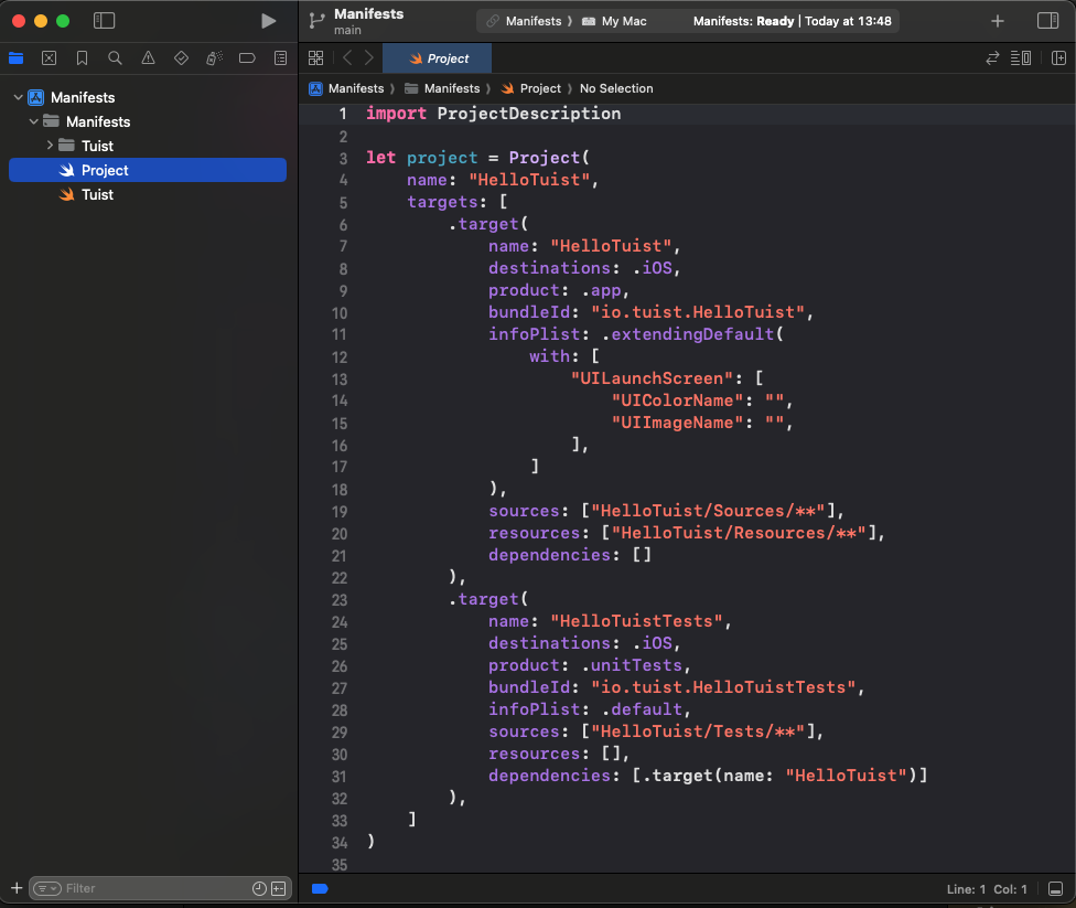
    XCode will be opened up showing to you Tuist project, with some source code, this Swift project configuration source code will be the responsilbe for generating the project scaffoling for your application (or library).

    tuistproj

    This Swift code uses the Tuist project description framework to define a project named «HelloTuist» with two main targets: an iOS app (HelloTuist) and a set of unit tests (HelloTuistTests). The main app target is configured as an iOS application with a unique bundle identifier, sources and resources from specified directories, and a custom launch screen setup in its Info.plist. The test target is set up for iOS unit testing, uses default Info.plist settings, includes test source files, and depends on the main app target for its operation.

    Lets continue with the workflow, next step is generating application project by typing:

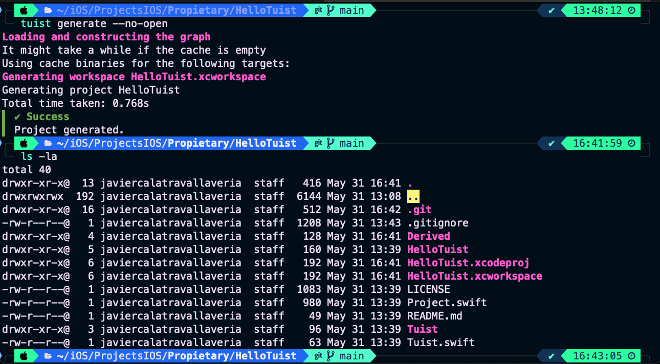
    $ tuist generate --no-open
    tuistgenerate

    By using this command, we have created the final .xcodeproj application project. The --no-open optional parameter was specified to prevent Xcode from opening the project automatically. We will open the project manually from the command line.

    $ xed .
    xcode

    The default project folder structure is different from what we’re accustomed to when coming from classical Xcode project creation. However, it’s something we can get used to, and it’s also configurable through the Tuist project.

    Deploying the app on the simulator is useful just to verify that everything works as expect

    Simulator Screenshot - iPhone 16 Pro - 2025-05-31 at 16.55.34

    From now on, focus only on your Swift application’s source code files. It’s important to remember that the .xcodeproj file is no longer part of your base code — it is autogenerated. Whenever you need to change project configurations, edit the Tuist project and run tuist generate.

    Setup application version

    The application version and build number are two parameters—MARKETING_VERSION and CURRENT_PROJECT_VERSION—managed in the project’s build settings. To set these values, open the Tuist project using the command line.

    $ tuist edit

    And set following changes (On Tuist prject):

    public extension Project {
        static let settings: Settings = {
            let baseConfiguration: SettingsDictionary = [
                "MARKETING_VERSION": "1.2.3",
                "CURRENT_PROJECT_VERSION": "42"
            ]
            let releaseConfiguration = baseConfiguration
            return Settings.settings(base: baseConfiguration, debug: baseConfiguration, release: releaseConfiguration)
        }()
    }
    
    public extension Target {
        static let settings: Settings = {
            let baseConfiguration: SettingsDictionary = [:]
            var releaseConfig = baseConfiguration
            return Settings.settings(base: baseConfiguration, debug: baseConfiguration, release: releaseConfig)
        }()
    }

    We aim to have a unique version value across all targets. To achieve this, we’ve set the version value at the project level and assigned an empty dictionary ([:]) in the target settings to inherit values from the project settings.

    Finally, configure the settings for both the project and target structures:

    let project = Project(
        name: "HelloTuist",
        settings: Project.settings,
        targets: [
            .target(
                name: "HelloTuist",
                destinations: .iOS,
                product: .app,
                bundleId: "io.tuist.HelloTuist",
                infoPlist: .extendingDefault(with: [
                    "CFBundleDisplayName": "Tuist App",
                    "CFBundleShortVersionString": "$(MARKETING_VERSION)",
                    "CFBundleVersion": "$(CURRENT_PROJECT_VERSION)"
                ]),
                sources: ["HelloTuist/Sources/**"],
                resources: ["HelloTuist/Resources/**"],
                dependencies: [],
                settings: Target.settings
            ),
            .target(
                name: "HelloTuistTests",
                destinations: .iOS,
                product: .unitTests,
                bundleId: "io.tuist.HelloTuistTests",
                infoPlist: .default,
                sources: ["HelloTuist/Tests/**"],
                resources: [],
                dependencies: [.target(name: "HelloTuist")]
            ),
        ]
    )

    The settings parameter is defined both at the project and target levels. Additionally, MARKETING_VERSION is linked to CFBundleShortVersionString in the Info.plist. As a result, the app will retrieve the version value from CFBundleShortVersionString.

    Once the Tuist project is set up, the application project should be regenerated.

    $ tuist generate --no-open
    rege

    And open application project adding following changes con the view:

    struct ContentView: View {
        var appVersion: String {
            let version = Bundle.main.object(forInfoDictionaryKey: "CFBundleShortVersionString") as? String ?? "?"
            let build = Bundle.main.object(forInfoDictionaryKey: "CFBundleVersion") as? String ?? "?"
            return "Version \(version) (\(build))"
        }
        
        var body: some View {
            NavigationView {
                List {
                    Section(header: Text("Information")) {
                        HStack {
                            Label("App versusion", systemImage: "number")
                            Spacer()
                            Text(appVersion)
                                .foregroundColor(.secondary)
                        }
                    }
                }
                .navigationTitle("Hello Tuist!")
                .navigationBarTitleDisplayMode(.inline)
            }
        }
    }

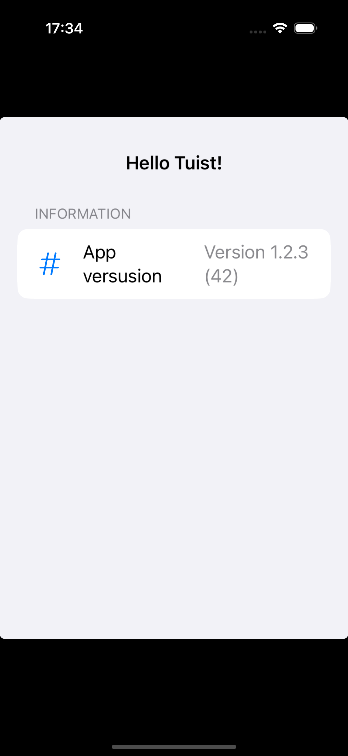
    Deploy app for checking that version is properly presented.

    Simulator Screenshot - iPhone 16 Pro - 2025-05-31 at 17.34.41

    As you have observed, the operations of setting the app version in the project configuration and presenting the version are decoupled. Additionally, changes made to the project are now easier to review.

    changes

    Adding library dependencies

    Another common project configuration is the addition of third-party libraries. I’m neither for nor against them—this is a religious debate I prefer not to engage in.

    For demonstration purposes, we will integrate the Kingfisher library to fetch a remote image from the internet and display it in the application’s view.

    Again, open back Tuist project by typing ‘tuist edit’ and set the library url on ‘Tuist/Package.swift’ file:

    let package = Package(
        name: "tuistHello",
        dependencies: [
            // Add your own dependencies here:
            .package(url: "https://github.com/onevcat/Kingfisher", .upToNextMajor(from: "8.3.2")),
            // You can read more about dependencies here: https://docs.tuist.io/documentation/tuist/dependencies
        ]
    )

    Also set dependencies attribute array:

    let project = Project(
        name: "HelloTuist",
        settings: Project.settings,
        targets: [
            .target(
                name: "HelloTuist",
                destinations: .iOS,
                product: .app,
                bundleId: "io.tuist.HelloTuist",
                infoPlist: .extendingDefault(with: [
                    "CFBundleDisplayName": "Tuist App",
                    "CFBundleShortVersionString": "$(MARKETING_VERSION)",
                    "CFBundleVersion": "$(CURRENT_PROJECT_VERSION)"
                ]),
                sources: ["HelloTuist/Sources/**"],
                resources: ["HelloTuist/Resources/**"],
                dependencies: [
                    .external(name: "Kingfisher")
                ],
                settings: Target.settings
            ),
            .target(
                name: "HelloTuistTests",
                destinations: .iOS,
                product: .unitTests,
                bundleId: "io.tuist.HelloTuistTests",
                infoPlist: .default,
                sources: ["HelloTuist/Tests/**"],
                resources: [],
                dependencies: [.target(name: "HelloTuist")]
            ),
        ]
    )

    Following workflow, re-generate application project by typing ‘tuist generate’.

    tuistgenfa

    … but this time something is going wrong. And is because when an external library is bein integrated iun a Tuist project we have to install it first. By typing following command app is downloaded and installed:

    $ tuist install

    After ‘tuist install’ execute ‘tuist generate –no-open’ for finally generating application project. Add following content to view:

    import Kingfisher
    import SwiftUI
    
    struct ContentView: View {
       ...
        var body: some View {
            NavigationView {
                List {
                    Section(header: Text("Information")) {
                        HStack {
                            Label("App versusion", systemImage: "number")
                            Spacer()
                            Text(appVersion)
                                .foregroundColor(.secondary)
                        }
                    }
                    KFImage(URL(string: "https://encrypted-tbn0.gstatic.com/images?q=tbn:ANd9GcQyfYoLcb2WNoStJH01TT2TLAf_JbD_FhIJng&s")!)
                        .resizable()
                        .aspectRatio(contentMode: .fit)
                        .frame(width: 300, height: 300)
                        .cornerRadius(12)
                        .shadow(radius: 5)
                        .padding()
                }
                .navigationTitle("Hello Tuist!")
                .navigationBarTitleDisplayMode(.inline)
            }
        }
    }

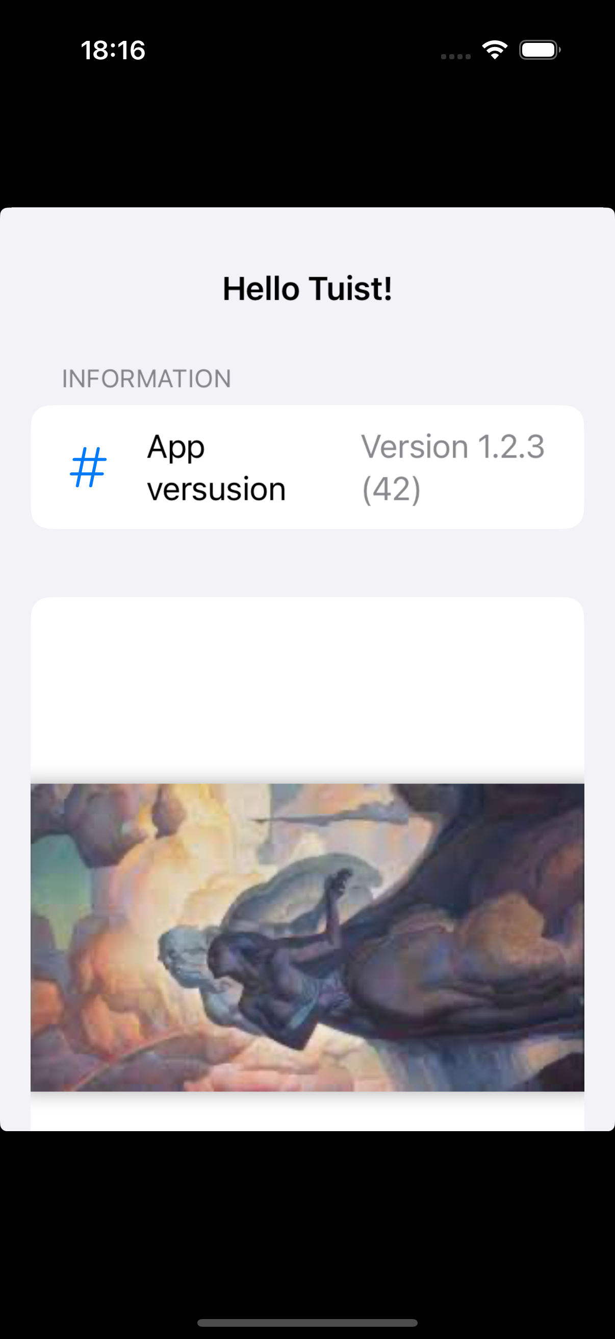
    Finally deploy app for checking that image is properly fetched:

    Simulator Screenshot - iPhone 16 Pro - 2025-05-31 at 18.16.20

    Finally deploy app for checking that image is properly fetched.

    Conclusions

    The first time I heard about this technology, I was immediately drawn to it. However, I must confess that I struggled at first to understand the workflow. That’s exactly why I decided to write this post.

    While Tuist might be overkill for small projects, it becomes essential for large ones—especially when you consider the number of lines of code and developers involved. After all, every big project started out small.

    Another major advantage is that changes to the project setup are decoupled from changes to the application itself. This makes them easier to review—much like comparing SwiftUI code to .xib files or storyboards.

    Who knows? Maybe Apple will one day release its own version of Tuist, just like it did with Combine and Swift Package Manager (SPM).

    You can find source code used for writing this post in following repository

    References