
Changing an iOS app icon can create both user and business value by offering personalization, seasonal or event-based marketing opportunities, and fresh ways to engage users without requiring an App Store resubmission. It allows apps to feel dynamic and relevant—whether through holiday icons, unlockable rewards for loyal users, or collectible designs tied to achievements. This flexibility also supports monetization strategies (e.g., premium icons for subscribers), strengthens community connection (such as sports teams or fan apps), and enables practical use cases like localization or representing different brands. In short, dynamic icons turn the app’s presence on the home screen into a living extension of the product experience. In this post, we’ll build a sample iOS app that demonstrates how to implement app icon switching.
Project Setup
First step is create a new App Icon:
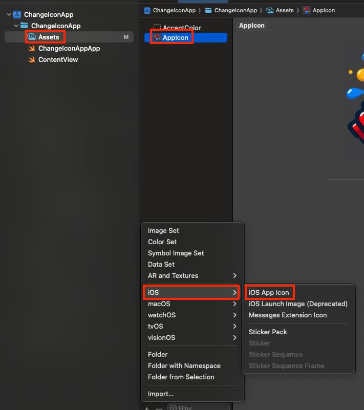
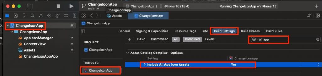
After adding a second app icon asset, select your app target, open Build Settings, and set Include All App Icon Assets to Yes. Note: verify your Xcode version—I’m using Xcode 16, and earlier versions configure this slightly differently.
At that point, you might be tempted to create an app with a live icon—like Calendar or Clock.
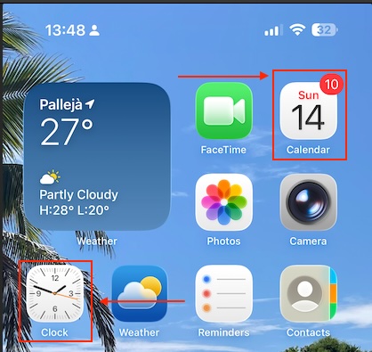
Unfortunately, third-party apps can’t do this—dynamic icons are a system-only capability enabled by Apple’s private entitlements. For everyone else, the app icon is a static resource in the signed bundle and can only be swapped for another prepackaged icon via setAlternateIconName(_:).
App Icon Manager
The component that where all icon changeability will be centered is following:
import UIKit
enum AppIconName: String {
case primary = "" // Default icon
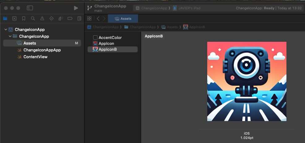
case dark = "AppIconB" // exact name for the alternative icon (no extension)
}
enum AppIconManager {
static var supportsAlternateIcons: Bool {
UIApplication.shared.supportsAlternateIcons
}
static var currentAlternateIconName: String? {
UIApplication.shared.alternateIconName
}
static func setAppIcon(_ icon: AppIconName, completion: ((Error?) -> Void)? = nil) {
guard supportsAlternateIcons else {
completion?(NSError(domain: "AppIcon", code: -1, userInfo: [NSLocalizedDescriptionKey: "This device does not support alternative icons"]))
return
}
let nameToSet: String? = (icon == .primary) ? nil : icon.rawValue
if UIApplication.shared.alternateIconName == nameToSet {
completion?(nil)
return
}
UIApplication.shared.setAlternateIconName(nameToSet) { error in
completion?(error)
}
}
}
The AppIconName enum represents the available icons (the default primary and an alternate one named AppIconB). The AppIconManager enum provides helper properties and a method: it checks if the device supports alternate icons, retrieves the currently active icon, and lets you switch to a new icon with setAppIcon. If the device doesn’t support icon changes or if the requested icon is already active, it gracefully exits, otherwise it uses UIApplication.shared.setAlternateIconName to apply the new icon and calls the completion handler with either an error or success.
View
This SwiftUI ContentView provides a simple UI that lets users toggle between the app’s default and alternative icons. It shows a large sun or moon symbol depending on the selected icon, and includes a switch labeled “Use alternative icon” that triggers AppIconManager to change the app icon when toggled. If the device doesn’t support alternate icons, the toggle is disabled and a warning message is displayed. The view also shows which icon is currently active, updates the user with a status message after each change (or error), and ensures the correct icon is applied when the view first appears.
struct ContentView: View {
    @AppStorage("useAltIcon") private var useAltIcon: Bool = false
    @State private var statusMsg: String = ""

    var body: some View {
        VStack(spacing: 20) {
            Image(systemName: useAltIcon ? "moon.fill" : "sun.max.fill")
                .font(.system(size: 56))
                .symbolRenderingMode(.hierarchical)

            Toggle("Use alternative icon", isOn: $useAltIcon)
                .onChange(of: useAltIcon) { _, newValue in
                    AppIconManager.setAppIcon(newValue ? .dark : .primary) { err in
                        if let err = err {
                            statusMsg = "It was not possible replacie icon: \(err.localizedDescription)"
                            // revertir el toggle si algo falla
                            useAltIcon.toggle()
                        } else {
                            statusMsg = newValue ? "Alternative icon activated." : "Default icon restored."
                        }
                    }
                }
                .disabled(!AppIconManager.supportsAlternateIcons)
                .padding(.horizontal)

            if !AppIconManager.supportsAlternateIcons {
                Text("This device does not support alternative icons.")
                    .font(.footnote)
                    .foregroundStyle(.secondary)
            }

            if let current = AppIconManager.currentAlternateIconName {
                Text("Current icon: \(current)")
                    .font(.footnote)
                    .foregroundStyle(.secondary)
            } else {
                Text("Curent icon: default")
                    .font(.footnote)
                    .foregroundStyle(.secondary)
            }

            if !statusMsg.isEmpty {
                Text(statusMsg)
                    .font(.footnote)
                    .foregroundStyle(.secondary)
                    .multilineTextAlignment(.center)
                    .padding(.top, 4)
            }

            Spacer()
        }
        .padding()
        .onAppear {
            let shouldBeAlt = useAltIcon
            AppIconManager.setAppIcon(shouldBeAlt ? .dark : .primary) { _ in }
        }
    }
}
Deploy the code on a simulator to validate its behavior (or real device):

The app icon is being replaced by the app itself.
Conclusions
In this post, I’ve shared a quick and easy feature you can implement to make your app more engaging. You can find source code that we have used for conducting this post in following GitHub repository.
References
- Configuring your app icon using an asset catalog
Apple Developer Documentation
- App icons
Apple Developer Documentation


