Autor: admin

  • Protect sensitive information in SwiftUI

    Protect sensitive information in SwiftUI

    The goal of this post is to present some techniques for obfuscating or preventing easy access to highly sensitive information, such as account or credit card numbers.
    Allow copy

    The first thing to clarify is which pieces of information can be copied and which cannot. This behavior is controlled by the .textSelection() modifier.

    struct SensitiveCard: View {
        let title: String
        let primary: String
        let secondary: String
        let icon: String
        let isSelectable: Bool
    
        var body: some View {
            VStack(alignment: .leading, spacing: 12) {
                HStack(spacing: 12) {
                    Image(systemName: icon)
                        .font(.title2)
                        .padding(10)
                        .background(.ultraThinMaterial, in: RoundedRectangle(cornerRadius: 14))
                    Text(title)
                        .font(.title3.weight(.semibold))
                    Spacer()
                }
                Text(primary)
                    .font(.system(.title2, design: .monospaced).weight(.semibold))
                    .conditionalTextSelection(isSelectable)
                Text(secondary)
                    .font(.subheadline)
                    .foregroundStyle(.secondary)
            }
            .padding(18)
            .background(
                RoundedRectangle(cornerRadius: 22, style: .continuous)
                    .fill(.regularMaterial)
                    .shadow(radius: 12, y: 6)
            )
        }
    }
    
    
    struct ConditionalTextSelection: ViewModifier {
        let enable: Bool
        
        func body(content: Content) -> some View {
            if enable {
                content.textSelection(.enabled)
            } else {
                content
            }
        }
    }
    
    extension View {
        func conditionalTextSelection(_ enable: Bool) -> some View {
            self.modifier(ConditionalTextSelection(enable: enable))
        }
    }

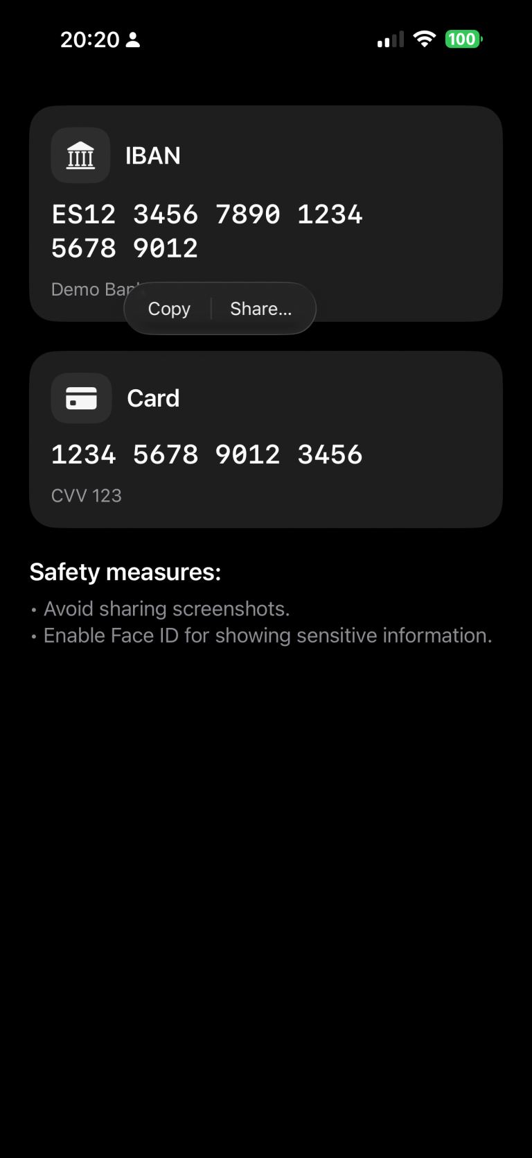
    In this example, we’ve chosen to make the IBAN copyable, while the card number remains restricted.

    struct ContentView: View {
        @State private var cardNumber = "1234 5678 9012 3456"
        @State private var cvv = "123"
        @State private var iban = "ES12 3456 7890 1234 5678 9012"
        @State private var textSelectability: TextSelectability = .disabled
    
        var body: some View {
            ScrollView {
                VStack(alignment: .leading, spacing: 24) {
                    
                    SensitiveCard(title: "IBAN",
                                  primary: iban,
                                  secondary: "Demo Bank",
                                  icon: "building.columns.fill",
                                  isSelectable: true)
                    
                    SensitiveCard(title: "Card",
                                  primary: cardNumber,
                                  secondary: "CVV \(cvv)",
                                  icon: "creditcard.fill",
                                  isSelectable: false)
    
                    VStack(alignment: .leading, spacing: 8) {
                        Text("Safety measures:")
                            .font(.title3.bold())
                        Text("• Avoid sharing screenshots.\n• Enable Face ID for showing sensitive information.")
                            .foregroundStyle(.secondary)
                    }
                }
                .padding(24)
            }
        }
    }

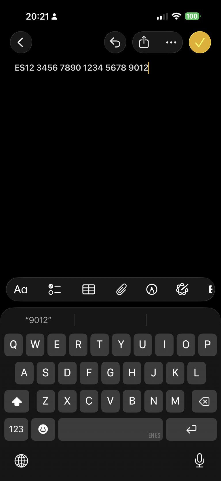
    Run the app and long-press the IBAN code. A contextual pop-up will appear — select “Copy.” Then switch to the Notes app and paste it. You’ll notice that the same operation cannot be performed with the card information.

    Privacy button

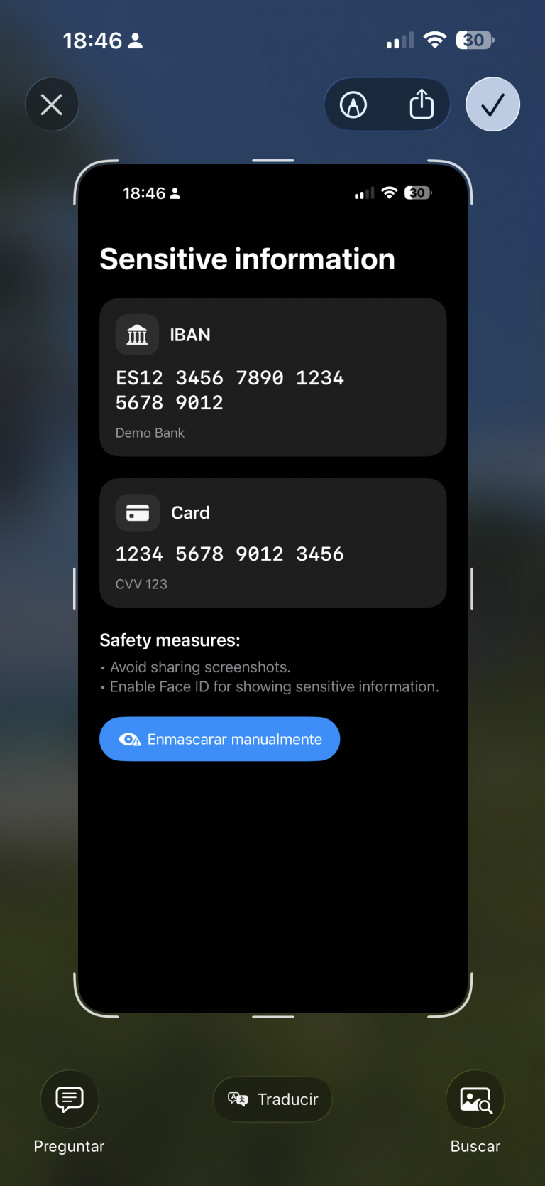
    A measure that can help build user trust is to provide a button that hides sensitive information:

    import SwiftUI
    
    struct ContentView: View {
        .....
        var body: some View {
            ScrollView {
                VStack(alignment: .leading, spacing: 24) {
                    ....
                    Button {
                        // Ejemplo: regenerar/limpiar datos
                        cardNumber = "•••• •••• •••• ••••"
                        cvv = "•••"
                        iban = "ES•• •••• •••• •••• •••• ••••"
                    } label: {
                        Label("Mask manually", systemImage: "eye.trianglebadge.exclamationmark.fill")
                    }
                    .buttonStyle(.borderedProminent)
                    .controlSize(.large)
                }
                .padding(24)
            }
        }
    }

    When changes are deployed:

    review

    Detect app activity

    An alternative to using a button, or a complementary feature, is detecting changes in the app’s activity — for example, when the app is moved to the background:

    import SwiftUI
    import UIKit
    
    struct ContentView: View {
        @Environment(\.scenePhase) private var scenePhase
        @State private var privacyMask = false
    ...
    
        var body: some View {
            ProtectedView {
                SensitiveView(hidden: $showScreenshotAlert)
            }
            .blur(radius: privacyMask ? 28 : 0)
            .overlay {
                if privacyMask {
                    ZStack {
                        Color.black.opacity(0.6).ignoresSafeArea()
                        VStack(spacing: 12) {
                            Image(systemName: "eye.slash.fill")
                                .font(.system(size: 36, weight: .semibold))
                            Text("Content hidden whilst app is not active")
                                .multilineTextAlignment(.center)
                                .font(.headline)
                        }
                        .foregroundColor(.white)
                        .padding()
                    }
                    .accessibilityHidden(true)
                }
            }
            .onChange(of: scenePhase) { phase in
                privacyMask = (phase != .active)
            }
            ...
    }

    Deploy and move app to background:

    review2

    Detect screenshot action

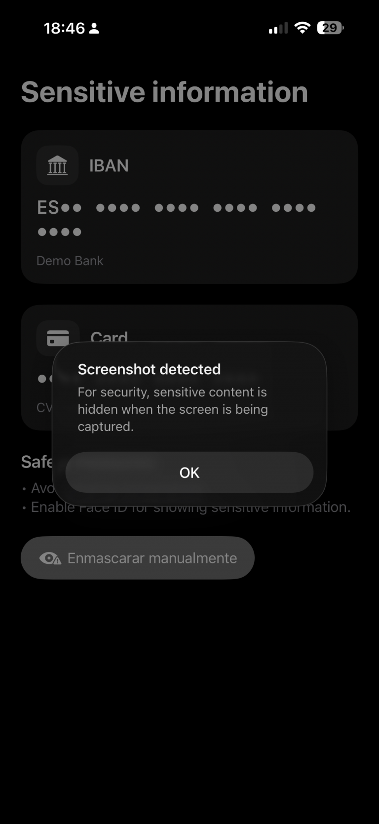
    An important point I discovered during this investigation is that, although the app can detect when a screenshot is taken — which sounds good — the screenshot is still captured anyway.

    My recommendation in that case would be to invalidate or regenerate the information if temporary keys are involved. Depending on the scenario, you could also notify the backend services that a screenshot has been taken.

    The code for detecting a screenshot is as follows:

    struct ContentView: View {
    ...
        @State private var showScreenshotAlert = false
    
        var body: some View {
            ProtectedView {
                SensitiveView(hidden: $showScreenshotAlert)
            }
           ...
            .onReceive(NotificationCenter.default.publisher(
                for: UIApplication.userDidTakeScreenshotNotification)) { _ in
                    showScreenshotAlert = true
                }
            .alert("Screenshot detected",
                   isPresented: $showScreenshotAlert) {
                Button("OK", role: .cancel) {}
            } message: {
                Text("For security, sensitive content is hidden when the screen is being captured.")
            }
        }
    }

    Ofuscate on Recording screen

    The final measure is to apply obfuscation when a screen recording is in progress:

    struct ProtectedView<Content: View>: View {
        @State private var isCaptured = UIScreen.main.isCaptured
        @ViewBuilder var content: () -> Content
    
        var body: some View {
            content()
                .blur(radius: isCaptured ? 25 : 0)
                .overlay {
                    if isCaptured {
                        ZStack {
                            Color.black.opacity(0.65).ignoresSafeArea()
                            VStack(spacing: 12) {
                                Image(systemName: "lock.fill")
                                    .font(.system(size: 32, weight: .bold))
                                Text(String(localized: "protected.overlay.title",
                                            defaultValue: "Content hidden while the screen is being captured"))
                                    .multilineTextAlignment(.center)
                                    .font(.headline)
                                    .padding(.horizontal)
                            }
                            .foregroundColor(.white)
                        }
                        .accessibilityHidden(true)
                    }
                }
                .onReceive(NotificationCenter.default.publisher(
                    for: UIScreen.capturedDidChangeNotification)) { _ in
                        isCaptured = UIScreen.main.isCaptured
                    }
        }
    }

    When a screen recording session is active and the user switches to our privacy app, the app detects the recording and can respond by displaying an overlay.

    recording

    Conclusions

    It’s not possible to achieve complete protection against data forgery or privacy breaches, but the more countermeasures you apply, the better your security becomes. That’s what I wanted to demonstrate in this post.

    You can find the source code for this example in the following GitHub repository.

    References

  • Rules to write Clean Code in Swift

    Rules to write Clean Code in Swift

    In this post we will focusfocus on showing how principles like KISS, DRY, and SOLID directly improve Swift code in everyday situations—such as structuring a ViewModel, reducing boilerplate in SwiftUI views, or designing protocols for networking.

    In this post we will revieew some roles principles by examples in Swift. This is could be considerered a continuation of a past post called ‘S.O.L.I.D. principles in Swift’

    Clean Code

    Clean code is code that is simple to read, easy to understand, and straightforward to maintain. It avoids unnecessary complexity by following principles like clarity, consistency, and separation of concerns, ensuring that each part of the code has a clear purpose. Clean code favors meaningful names, small and focused functions, and eliminates duplication, making it easier for other developers (and your future self) to work with. The goal is not just to make the computer run the program, but to make the code itself communicate its intent clearly to humans.

    Clean Code is the overarching goal of writing software that is easy to read, understand, and maintain, while the SOLID principles are a concrete set of guidelines that help achieve this goal by structuring classes and dependencies in a clear, flexible way. In essence, Clean Code defines what good code should feel like, and SOLID offers how to design object-oriented code that stays true to that vision, ensuring maintainability, scalability, and clarity.

    SOC – Separation Of Concepts

    Separation of Concerns (SoC) is a clean code principle that says each part of your code should focus on a single, well-defined responsibility. By splitting concerns, you reduce complexity, improve readability, and make code easier to maintain and test. In iOS/Swift, this often means separating data models, networking logic, business logic (ViewModel), and UI (View) instead of mixing them in one place.

    import SwiftUI
    import Foundation
    
    // MARK: - Model (data only)
    struct Post: Decodable, Identifiable {
        let id: Int
        let title: String
    }
    
    // MARK: - Networking (concern: fetching data)
    final class PostService {
        func fetchPosts() async throws -> [Post] {
            let url = URL(string: "https://jsonplaceholder.typicode.com/posts")!
            let (data, _) = try await URLSession.shared.data(from: url)
            return try JSONDecoder().decode([Post].self, from: data)
        }
    }
    
    // MARK: - ViewModel (concern: state & business logic)
    @MainActor
    final class PostListViewModel: ObservableObject {
        @Published var posts: [Post] = []
        @Published var errorMessage: String?
    
        private let service = PostService()
    
        func loadPosts() async {
            do {
                posts = try await service.fetchPosts()
            } catch {
                errorMessage = "Failed to load posts"
            }
        }
    }
    
    // MARK: - View (concern: UI)
    struct PostListView: View {
        @StateObject private var vm = PostListViewModel()
    
        var body: some View {
            NavigationView {
                List(vm.posts) { post in
                    Text(post.title)
                }
                .navigationTitle("Posts")
                .task { await vm.loadPosts() }
            }
        }
    }
    

    Where’s the SoC?

    • Model (Post) → defines the data only.

    • Service (PostService) → knows how to fetch posts from the network.

    • ViewModel (PostListViewModel) → manages state and error handling.

    • View (PostListView) → displays UI and reacts to state changes.

    Each layer does one thing well, instead of mixing networking, logic, and UI together.

    DRY – Do not repeat yourself

    DRY (Don’t Repeat Yourself) is a clean code principle that says you should avoid duplicating logic across your codebase. Instead, extract common behavior into reusable functions, extensions, or abstractions. This reduces errors, makes updates easier, and improves maintainability.

    ❌ Without DRY (duplicated logic)

    struct User {
        let name: String
        let email: String
    }
    
    struct Product {
        let title: String
        let price: Double
    }
    
    func printUser(_ user: User) {
        print("----")
        print("Name: \(user.name)")
        print("Email: \(user.email)")
        print("----")
    }
    
    func printProduct(_ product: Product) {
        print("----")
        print("Title: \(product.title)")
        print("Price: \(product.price)")
        print("----")
    }
    

    The logic for printing the separators (----) and formatting output is repeated in both functions.

    ✅ With DRY (reusable abstraction)

    protocol Printable {
        var descriptionLines: [String] { get }
    }
    
    struct User: Printable {
        let name: String
        let email: String
        
        var descriptionLines: [String] {
            [
                "Name: \(name)",
                "Email: \(email)"
            ]
        }
    }
    
    struct Product: Printable {
        let title: String
        let price: Double
        
        var descriptionLines: [String] {
            [
                "Title: \(title)",
                "Price: \(price)"
            ]
        }
    }
    
    // Generic reusable function
    func printEntity(_ entity: Printable) {
        print("----")
        entity.descriptionLines.forEach { print($0) }
        print("----")
    }
    
    // Usage
    let user = User(name: "Alice", email: "alice@email.com")
    let product = Product(title: "iPhone", price: 999.99)
    
    printEntity(user)
    printEntity(product)
    

    Now, the separator and printing logic exist in one place (printEntity). If we want to change the format, we update it once, not in every function.

    KISS-Keep it simple stupid

    KISS (Keep It Simple, Stupid) is a clean code principle that emphasizes writing code in the simplest way possible, avoiding unnecessary complexity or over-engineering. The goal is clarity: solve the problem directly instead of anticipating extra cases you don’t need yet.

    ❌ Not KISS (too complex for a simple counter)

    import SwiftUI
    
    struct ComplexCounterView: View {
        @State private var count = 0
        
        var body: some View {
            VStack {
                Text("Count: \(count)")
                    .font(.largeTitle)
                
                HStack {
                    Button("Increment") { updateCount(by: 1) }
                    Button("Decrement") { updateCount(by: -1) }
                }
            }
        }
        
        // Over-abstracted logic for a simple task
        private func updateCount(by value: Int) {
            let newValue = count + value
            if newValue >= 0 {
                count = newValue
            } else {
                count = 0
            }
        }
    }
    

    Too much abstraction (updateCount) and rules for a trivial counter.


    ✅ KISS (straightforward and clear)

    import SwiftUI
    
    struct SimpleCounterView: View {
        @State private var count = 0
        
        var body: some View {
            VStack {
                Text("Count: \(count)")
                    .font(.largeTitle)
                
                HStack {
                    Button("−") { if count > 0 { count -= 1 } }
                    Button("+") { count += 1 }
                }
            }
        }
    }
    

    The code is direct, easy to read, and does only what’s needed.

    DYC-Document your code

    DYC (Document Your Code) is a clean code principle that emphasizes writing code that is self-explanatory whenever possible, but also adding clear, concise documentation when something isn’t obvious. In Swift, this is often done with /// doc comments, which Xcode uses to show inline documentation when hovering over symbols. The idea is to make the code not just work, but also easy to understand and use for other developers (or your future self).

    ✅ Example in Swift using DYC

    import Foundation
    
    /// Represents a user in the system.
    struct User {
        /// Unique identifier for the user.
        let id: Int
        
        /// The user's display name.
        let name: String
        
        /// The user's email address.
        let email: String
    }
    
    /// Protocol defining operations to fetch users.
    protocol UserRepository {
        /// Fetches all available users from a data source.
        /// - Returns: An array of `User` objects.
        /// - Throws: An error if fetching fails.
        func fetchUsers() async throws -> [User]
    }
    
    /// Remote implementation of `UserRepository` that calls an API.
    final class RemoteUserRepository: UserRepository {
        private let baseURL: URL
        
        /// Creates a new repository with the given API base URL.
        /// - Parameter baseURL: The base URL of the remote API.
        init(baseURL: URL) {
            self.baseURL = baseURL
        }
        
        /// Calls the `/users` endpoint and decodes the response into a list of `User`.
        /// - Throws: `URLError` if the network call fails or the response is invalid.
        /// - Returns: An array of users retrieved from the server.
        func fetchUsers() async throws -> [User] {
            let url = baseURL.appendingPathComponent("users")
            let (data, response) = try await URLSession.shared.data(from: url)
            
            guard (response as? HTTPURLResponse)?.statusCode == 200 else {
                throw URLError(.badServerResponse)
            }
            
            return try JSONDecoder().decode([User].self, from: data)
        }
    }
    

    Why this follows DYC

    • Each type and method has a short description of what it does.

    • Methods document parameters, return values, and possible errors.

    • Xcode can show these comments in Quick Help (Option + Click) for better developer experience.

    YAGNI-You’re not going to need it

    YAGNI (You Aren’t Gonna Need It) is a clean code principle that reminds developers not to add functionality until it’s actually needed. Writing “just in case” code leads to complexity, unused features, and harder maintenance. Instead, implement only what the current requirements demand, and extend later when there’s a real need.


    ❌ Violating YAGNI (adding unnecessary features)

    import SwiftUI
    
    struct OverEngineeredCounterView: View {
        @State private var count = 0
        
        var body: some View {
            VStack {
                Text("Count: \(count)")
                    .font(.largeTitle)
                
                HStack {
                    Button("Increment") { updateCount(by: 1) }
                    Button("Decrement") { updateCount(by: -1) }
                    Button("Reset") { resetCount() }          // Not needed (yet)
                    Button("Multiply ×2") { multiplyCount() } // Not needed (yet)
                }
            }
        }
        
        private func updateCount(by value: Int) {
            count += value
        }
        
        private func resetCount() { count = 0 }
        private func multiplyCount() { count *= 2 }
    }
    

    Only increment and decrement are required, but reset and multiply were added “just in case.”


    ✅ Following YAGNI (keep it simple until needed)

    import SwiftUI
    
    struct SimpleCounterView: View {
        @State private var count = 0
        
        var body: some View {
            VStack {
                Text("Count: \(count)")
                    .font(.largeTitle)
                
                HStack {
                    Button("−") { count -= 1 }
                    Button("+") { count += 1 }
                }
            }
        }
    }
    

    The code contains only the features needed today. If requirements change, new functionality can be added later.

    LoD-Law of Demeter

    The Law of Demeter (LoD), also called the principle of least knowledge, says:
    A unit of code should only talk to its immediate collaborators (“friends”), not to the internals of those collaborators (“friends of friends”)’.

    In practice, this means avoiding long chains like order.customer.address.city, because it creates tight coupling and makes the code fragile if internal structures change. Instead, each object should expose only what is necessary.

    ❌ Violating the Law of Demeter

    struct Address {
        let city: String
    }
    
    struct Customer {
        let address: Address
    }
    
    struct Order {
        let customer: Customer
    }
    
    func printOrderCity(order: Order) {
        // ❌ Too many “hops” (order → customer → address → city)
        print(order.customer.address.city)
    }
    

    If the internal structure of Customer or Address changes, this function breaks.


    ✅ Following the Law of Demeter

    struct Address {
        let city: String
    }
    
    struct Customer {
        private let address: Address
        
        init(address: Address) {
            self.address = address
        }
        
        /// Expose only what’s needed
        func getCity() -> String {
            return address.city
        }
    }
    
    struct Order {
        private let customer: Customer
        
        init(customer: Customer) {
            self.customer = customer
        }
        
        /// Expose only what’s needed
        func getCustomerCity() -> String {
            return customer.getCity()
        }
    }
    
    func printOrderCity(order: Order) {
        // ✅ Only talks to Order, not Order’s internals
        print(order.getCustomerCity())
    }
    

    Now printOrderCity only knows about Order. The details of Customer and Address are hidden, so changes in those types won’t ripple outward.

    Lesson:

    • ❌ Don’t chain through multiple objects (a.b.c.d).

    • ✅ Provide methods that expose the needed behavior directly.

    Conclusions

    We have demonstrated how the Clean principles align with Swift, so there is no excuse for not applying them. 

  • Xcode 16: Alternate App Icons in iOS

    Xcode 16: Alternate App Icons in iOS

    Changing an iOS app icon can create both user and business value by offering personalization, seasonal or event-based marketing opportunities, and fresh ways to engage users without requiring an App Store resubmission. It allows apps to feel dynamic and relevant—whether through holiday icons, unlockable rewards for loyal users, or collectible designs tied to achievements. This flexibility also supports monetization strategies (e.g., premium icons for subscribers), strengthens community connection (such as sports teams or fan apps), and enables practical use cases like localization or representing different brands. In short, dynamic icons turn the app’s presence on the home screen into a living extension of the product experience. In this post, we’ll build a sample iOS app that demonstrates how to implement app icon switching.

    Project Setup

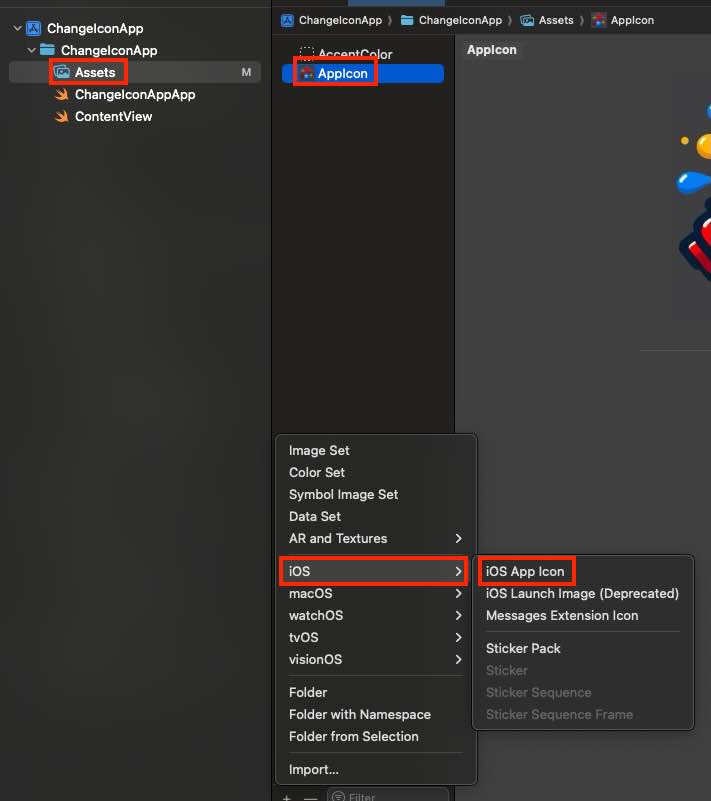
    First step is create a new App Icon:

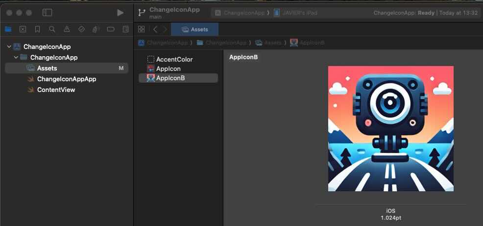
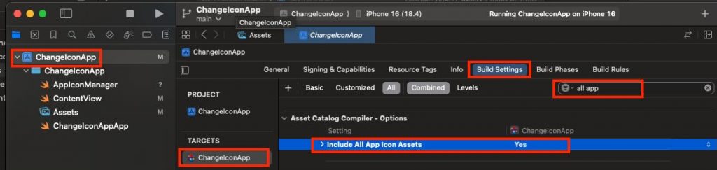
    After adding a second app icon asset, select your app target, open Build Settings, and set Include All App Icon Assets to Yes. Note: verify your Xcode version—I’m using Xcode 16, and earlier versions configure this slightly differently.

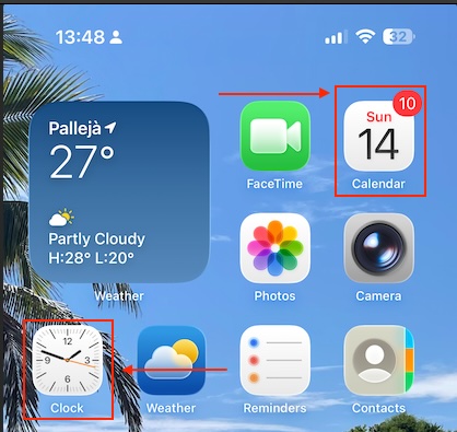
    At that point, you might be tempted to create an app with a live icon—like Calendar or Clock.


    Unfortunately, third-party apps can’t do this—dynamic icons are a system-only capability enabled by Apple’s private entitlements. For everyone else, the app icon is a static resource in the signed bundle and can only be swapped for another prepackaged icon via setAlternateIconName(_:).

    App Icon Manager

    The component that where all icon changeability will be centered is following:

    import UIKit
    
    enum AppIconName: String {
        case primary = ""          // Default icon
        case dark = "AppIconB"     // exact name for the alternative icon (no extension)
    }
    
    enum AppIconManager {
        static var supportsAlternateIcons: Bool {
            UIApplication.shared.supportsAlternateIcons
        }
    
        static var currentAlternateIconName: String? {
            UIApplication.shared.alternateIconName
        }
    
        static func setAppIcon(_ icon: AppIconName, completion: ((Error?) -> Void)? = nil) {
            guard supportsAlternateIcons else {
                completion?(NSError(domain: "AppIcon", code: -1, userInfo: [NSLocalizedDescriptionKey: "This device does not support alternative icons"]))
                return
            }
    
            let nameToSet: String? = (icon == .primary) ? nil : icon.rawValue
    
            if UIApplication.shared.alternateIconName == nameToSet {
                completion?(nil)
                return
            }
    
            UIApplication.shared.setAlternateIconName(nameToSet) { error in
                completion?(error)
            }
        }
    }
    

    The AppIconName enum represents the available icons (the default primary and an alternate one named AppIconB). The AppIconManager enum provides helper properties and a method: it checks if the device supports alternate icons, retrieves the currently active icon, and lets you switch to a new icon with setAppIcon. If the device doesn’t support icon changes or if the requested icon is already active, it gracefully exits, otherwise it uses UIApplication.shared.setAlternateIconName to apply the new icon and calls the completion handler with either an error or success.

    View

    This SwiftUI ContentView provides a simple UI that lets users toggle between the app’s default and alternative icons. It shows a large sun or moon symbol depending on the selected icon, and includes a switch labeled “Use alternative icon” that triggers AppIconManager to change the app icon when toggled. If the device doesn’t support alternate icons, the toggle is disabled and a warning message is displayed. The view also shows which icon is currently active, updates the user with a status message after each change (or error), and ensures the correct icon is applied when the view first appears.

    struct ContentView: View {
        @AppStorage("useAltIcon") private var useAltIcon: Bool = false
        @State private var statusMsg: String = ""
    
        var body: some View {
            VStack(spacing: 20) {
                Image(systemName: useAltIcon ? "moon.fill" : "sun.max.fill")
                    .font(.system(size: 56))
                    .symbolRenderingMode(.hierarchical)
    
                Toggle("Use alternative icon", isOn: $useAltIcon)
                    .onChange(of: useAltIcon) { _, newValue in
                        AppIconManager.setAppIcon(newValue ? .dark : .primary) { err in
                            if let err = err {
                                statusMsg = "It was not possible replacie icon: \(err.localizedDescription)"
                                // revertir el toggle si algo falla
                                useAltIcon.toggle()
                            } else {
                                statusMsg = newValue ? "Alternative icon activated." : "Default icon restored."
                            }
                        }
                    }
                    .disabled(!AppIconManager.supportsAlternateIcons)
                    .padding(.horizontal)
    
                if !AppIconManager.supportsAlternateIcons {
                    Text("This device does not support alternative icons.")
                        .font(.footnote)
                        .foregroundStyle(.secondary)
                }
    
                if let current = AppIconManager.currentAlternateIconName {
                    Text("Current icon: \(current)")
                        .font(.footnote)
                        .foregroundStyle(.secondary)
                } else {
                    Text("Curent icon: default")
                        .font(.footnote)
                        .foregroundStyle(.secondary)
                }
    
                if !statusMsg.isEmpty {
                    Text(statusMsg)
                        .font(.footnote)
                        .foregroundStyle(.secondary)
                        .multilineTextAlignment(.center)
                        .padding(.top, 4)
                }
    
                Spacer()
            }
            .padding()
            .onAppear {
                let shouldBeAlt = useAltIcon
                AppIconManager.setAppIcon(shouldBeAlt ? .dark : .primary) { _ in }
            }
        }
    }

    Deploy the code on a simulator to validate its behavior (or real device):

    review

    The app icon is being replaced by the app itself.

    Conclusions

    In this post, I’ve shared a quick and easy feature you can implement to make your app more engaging. You can find source code that we have used for conducting this post in following GitHub repository.

    References

  • iOS Dev between Combine and Delegate/Closure

    iOS Dev between Combine and Delegate/Closure

    When to use Combine versus the delegate and closure approaches is a great point to clarify because many developers struggle to choose the right tool for different scenarios, especially as Apple continues to expand its reactive frameworks while traditional patterns remain widely used. This post pretends to highlight the trade-offs—such as Combine’s power in managing complex, asynchronous data streams and chaining operators, versus the simplicity and low-overhead of closures for one-off callbacks or delegates for structured, reusable communication.

    The dilemma

    Combine, delegates, and closures all solve the same core problem: communicating results or events between components asynchronously.

    Here’s what they share in common:

    • Asynchronous communication → all three let one part of your app notify another when “something happened” without blocking.

    • Decoupling → the caller doesn’t need to know how the callee works, only what result or event it sends back.

    • Custom API design → you can choose the style (reactive stream, callback, or protocol) that best fits your use case, but under the hood they’re all just passing messages across boundaries.

    • Memory management concerns → all require care with retain cycles ([weak self] in closures, weak delegates, cancellables in Combine).

    • Interoperability → you can wrap one into another (e.g., turn a delegate or closure into a Publisher, or call a closure inside a delegate method).

    In short: they’re different abstractions over the same idea of event handling and result delivery, just with different levels of structure and power.

    The rule of thumb

    Use Combine when…

    • You’re dealing with streams of values over time (state updates, network retries, text search with debounce, multi-source merges).

    • You need operator chains (map/filter/flatMap/throttle/retry/catch) and cancellable pipelines you can pause or tear down with a single AnyCancellable.

    • You’re deep in SwiftUI (@Published, ObservableObject, view models) or want fan-out to multiple subscribers.

    • Testing with schedulers and time (virtual clocks) matters.

    Use delegates/closures when…

    • It’s a one-shot or simple callback (“user picked photo”, “request finished”, “button tapped”).

    • You want minimal overhead & maximal clarity in local APIs; fewer allocations and less indirection.

    • The interaction is structured and two-way (classic UIKit delegate lifecycles) or you’re writing a library that shouldn’t force a reactive dependency.

    Examples

    Example (type-ahead search with debouncing & cancellation):

    import Combine
    import UIKit
    
    final class SearchViewModel {
        @Published var query: String = ""
        @Published private(set) var results: [Repo] = []
    
        private var bag = Set<AnyCancellable>()
        private let api = GitHubAPI()
    
        init() {
            $query
                .debounce(for: .milliseconds(300), scheduler: RunLoop.main)
                .removeDuplicates()
                .map { $0.trimmingCharacters(in: .whitespacesAndNewlines) }
                .filter { !$0.isEmpty }
                .flatMap { q in
                    self.api.searchRepos(query: q)              // -> AnyPublisher<[Repo], Error>
                        .replaceError(with: [])                 // surface errors as empty for UX
                }
                .receive(on: RunLoop.main)
                .assign(to: &$results)
        }
    }
    
    struct Repo: Decodable { let name: String }
    
    final class GitHubAPI {
        func searchRepos(query: String) -> AnyPublisher<[Repo], Error> {
            let url = URL(string: "https://api.github.com/search/repositories?q=\(query)")!
            return URLSession.shared.dataTaskPublisher(for: url)
                .map(\.data)
                .decode(type: SearchResponse.self, decoder: JSONDecoder())
                .map(\.items)
                .eraseToAnyPublisher()
        }
    }
    
    struct SearchResponse: Decodable { let items: [Repo] }
    

    Example (delegate for a child picker reporting a single selection):

    protocol ColorPickerViewControllerDelegate: AnyObject {
        func colorPicker(_ picker: ColorPickerViewController, didSelect color: UIColor)
    }
    
    final class ColorPickerViewController: UIViewController {
        weak var delegate: ColorPickerViewControllerDelegate?
    
        // call once when a color is chosen
        private func didChoose(_ color: UIColor) {
            delegate?.colorPicker(self, didSelect: color)
            dismiss(animated: true)
        }
    }
    
    // Parent sets itself as delegate
    final class SettingsViewController: UIViewController, ColorPickerViewControllerDelegate {
        func presentPicker() {
            let picker = ColorPickerViewController()
            picker.delegate = self
            present(picker, animated: true)
        }
    
        func colorPicker(_ picker: ColorPickerViewController, didSelect color: UIColor) {
            view.backgroundColor = color
        }
    }
    

    Closure variant (simple one-shot completion):

    final class ImageLoader {
        func load(_ url: URL, completion: @escaping (Result<UIImage, Error>) -> Void) {
            URLSession.shared.dataTask(with: url) { data, _, error in
                if let e = error { completion(.failure(e)); return }
                guard let data = data, let image = UIImage(data: data) else {
                    completion(.failure(NSError(domain: "decode", code: -1)))
                    return
                }
                completion(.success(image))
            }.resume()
        }
    }
    

    Quick decision checklist

    • Do I expect multiple values over time that I want to transform/combine? → Combine

    • Is it a single, directed callback (child → parent or one network response)? → Delegate/Closure

    • Do I need easy cancellation, debouncing, retries, or operator chains? → Combine

    • Is simplicity, minimal dependencies, or pre–iOS 13 support important? → Delegate/Closure

    💡Tip: don’t force reactive patterns everywhere—use Combine where its composability shines, and keep the rest lightweight.

    Bridge between them

    Combine and delegates/closures can absolutely be mixed in the same project, and in fact that’s often the most pragmatic approach. They aren’t mutually exclusive, they just solve different layers of the problem:

    • Frameworks & SDKs: Many Apple and third-party APIs still expose delegates or completion handlers (e.g. CLLocationManager, URLSession).

    • Your app architecture: You might want to stay “Combine-first” in your view models, but still need to talk to APIs that rely on delegate or closure callbacks.

    Example: turning a delegate into a Combine publisher:
    import Combine
    import CoreLocation
    
    final class LocationManagerDelegateProxy: NSObject, CLLocationManagerDelegate {
        let subject = PassthroughSubject<CLLocation, Never>()
    
        func locationManager(_ manager: CLLocationManager, didUpdateLocations locations: [CLLocation]) {
            if let loc = locations.last {
                subject.send(loc)
            }
        }
    }
    
    // Usage
    let locationManager = CLLocationManager()
    let proxy = LocationManagerDelegateProxy()
    locationManager.delegate = proxy
    
    let cancellable = proxy.subject
        .sink { location in
            print("Got location:", location)
        }
    

    Example: wrapping a closure in a publisher

    func loadImagePublisher(from url: URL) -> AnyPublisher<UIImage, Error> {
        Future { promise in
            URLSession.shared.dataTask(with: url) { data, _, error in
                if let e = error {
                    promise(.failure(e))
                } else if let data, let image = UIImage(data: data) {
                    promise(.success(image))
                } else {
                    promise(.failure(NSError(domain: "decode", code: -1)))
                }
            }.resume()
        }
        .eraseToAnyPublisher()
    }
    

    Conclusions

    I hope this helped clarify when it makes sense to use Combine and when a delegate or closure is the better fit. Most importantly, remember that these approaches are not mutually exclusive—you don’t need to force reactive patterns into every situation. Instead, use Combine where its strengths truly shine, and rely on delegates or closures when simplicity is all you need.

    References

    • Combine

      Apple Developer Documentation

  • Goodbye Raw Strings, Hello swift-tagged

    Goodbye Raw Strings, Hello swift-tagged

    There is a subtle but common problem in Swift development: relying on raw types like String or UUID for identifiers leads to fragile code where values can be accidentally swapped or misused without the compiler noticing. By explaining how swift-tagged introduces zero-cost, strongly typed wrappers, I wanted to show you how other iOS developers how to prevent whole categories of bugs at compile time, while keeping APIs clean, expressive, and fully compatible with Codable, Hashable, and other Swift protocols. It’s a practical, easy-to-adopt tool that makes codebases more robust, and many developers may not even realize how much type safety they’re leaving on the table until they see a real-world example.

    The problem

    The following code is syntactically correct, but semantically wrong.

        struct UserRaw { let id: UUID }
        struct ProductRaw { let id: UUID }
    
        func registerPurchaseRaw(userID: UUID, productID: UUID) {
            log("✅ Purchase registered (RAW): user=\(userID) product=\(productID)")
        }
    
        func demoRaw() {
            log("— RAW demo —")
            let rawUser = UserRaw(id: UUID())
            let rawProduct = ProductRaw(id: UUID())
    
            // ❌ Compiles, BUT CODE SEMANTICALLY IS WRONG (crossed arguments)
            registerPurchaseRaw(userID: rawProduct.id, productID: rawUser.id)
            log("")
        }

    This code defines two structs, UserRaw and ProductRaw, each holding an id of type UUID, and a function registerPurchaseRaw(userID:productID:) that logs a message about a registered purchase. In demoRaw(), it creates a user and a product, then mistakenly calls registerPurchaseRaw with the arguments swapped (userID is given the product’s ID and productID is given the user’s ID). The key issue is that both IDs are plain UUIDs, so the compiler cannot distinguish between them—this compiles without error even though it is logically wrong. The problem is a lack of type safety, which can lead to subtle bugs where mismatched identifiers are passed to functions unnoticed until runtime.

    swift-tagged library

    The swift-tagged library is a lightweight Swift package from Point-Free that lets you create strongly typed wrappers around existing primitive types like String, Int, or UUID. Instead of passing around raw values (e.g. using plain UUID for both UserID and OrderID), you can “tag” them with distinct types so the compiler enforces correct usage—preventing accidental mix-ups that would otherwise compile but cause logic bugs. It’s a zero-cost abstraction, meaning it adds no runtime overhead, and it integrates seamlessly with protocols like Codable, Hashable, and Equatable. In practice, swift-tagged helps make Swift code more expressive, self-documenting, and safer, especially when modeling identifiers and domain-specific values in iOS or server-side Swift apps.

    This is new proposal with swift-tagged library:

        struct UserTag {}
        struct ProductTag {}
    
        typealias UserID = Tagged<UserTag, UUID>
        typealias ProductID = Tagged<ProductTag, UUID>
    
        struct User {
            let id: UserID
        }
        struct Product {
            let id: ProductID
        }
    
        func registerPurchase(userID: UserID, productID: ProductID) {
            log("✅ Purchase registered (Tagged): user=\(userID) product=\(productID)")
        }
    
        func demoTagged() {
            log("— Tagged demo —")
            let user = User(id: UserID(UUID()))
            let product = Product(id: ProductID(UUID()))
            registerPurchase(userID: user.id, productID: product.id)
    
            // ❌ This no longer compiles (type mismatch): // registerPurchase(userID: product.id, productID: user.id
            registerPurchase(userID: product.id, productID: user.id)
            log("")
        }

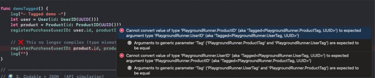
    Now at compile time, semantic error is being detected:

    Codable types

    swift-tagged works with Codable types because its Tagged wrapper is designed to forward encoding and decoding responsibilities to the underlying raw type (such as String, Int, or UUID) that already conforms to Codable. This means when you use a Tagged<User, UUID> as a property in a model, Swift’s Codable machinery simply encodes or decodes the inner UUID as usual, while still preserving the type-safe distinction at compile time. As a result, you get the safety of strongly typed identifiers without having to write custom Codable implementations or change how your models interact with JSON or other encoded data.

            log("— Codable + JSON —")
    
            let user = User(id: UserID(UUID()))
            let product = Product(id: ProductID(UUID()))
            let request = PurchaseRequest(userID: user.id, productID: product.id)
    
            // Encode → JSON
            do {
                let encoder = JSONEncoder()
                encoder.outputFormatting = [.prettyPrinted, .sortedKeys]
                let jsonData = try encoder.encode(request)
                if let jsonString = String(data: jsonData, encoding: .utf8) {
                    log("📤 JSON sent to server:")
                    log(jsonString)
                }
            } catch {
                log("Encoding error:", error.localizedDescription)
            }
    
            // Decode ← JSON
            let jsonInput = """
            {
                "userID": "\(UUID())",
                "productID": "\(UUID())"
            }
            """.data(using: .utf8)!
    
            do {
                let decoded = try JSONDecoder().decode(PurchaseRequest.self, from: jsonInput)
                log("📥 JSON received and decoded to Swift struct:")
                log("userID: \(decoded.userID)")
                log("productID: \(decoded.productID)")
            } catch {
                log("Decoding error:", error.localizedDescription)
            }
    
            log("")

    This code demonstrates how a PurchaseRequest that uses swift-tagged identifiers can be seamlessly encoded to and decoded from JSON. First, it creates a User and a Product, builds a PurchaseRequest with their strongly typed IDs, and then uses JSONEncoder to serialize it into a nicely formatted JSON string, simulating data being sent to a server. Next, it constructs a JSON string containing new random UUIDs for userID and productID, converts it to Data, and decodes it back into a PurchaseRequest instance with JSONDecoder. The output shows that although the code benefits from type safety at compile time, the wrapped values still encode and decode just like plain UUIDs, ensuring compatibility with standard JSON APIs.

    Hashable

    Yes—swift-tagged works with Hashable types because its Tagged<Tag, RawValue> wrapper automatically conforms to Hashable whenever the underlying RawValue does (e.g., UUID, String, Int). This means tagged IDs like UserID or ProductID can be used directly in Sets to enforce uniqueness, as keys in Dictionarys, or inside other Hashable models without extra boilerplate. In practice, you get the benefits of type safety and domain clarity while still leveraging Swift’s built-in hashing behavior, all with zero runtime overhead.

            // ---------------------------------------------------------
            // 🔢 4. Using swift-tagged with Hashable collections
            // ---------------------------------------------------------
    
            // Sets of tagged IDs
            let user = User(id: UserID(UUID()))
            var seenUsers = Set<UserID>()
            seenUsers.insert(user.id)                 // from earlier code
            seenUsers.insert(UserID(UUID()))          // a different user
            seenUsers.insert(user.id)                 // duplicate; Set ignores it
    
            log("👥 Seen users (unique count): \(seenUsers.count)")
    
            // Dictionaries with tagged IDs as keys
            let product = Product(id: ProductID(UUID()))
            var productStock: [ProductID: Int] = [:]
            productStock[product.id] = 10             // from earlier code
            let anotherProductID = ProductID(UUID())
            productStock[anotherProductID] = 5
    
            log("📦 Product stock:")
            for (pid, qty) in productStock {
                log(" - \(pid): \(qty)")
            }
    
            // Using tagged IDs inside Hashable models
            struct CartItem: Hashable {
                let productID: ProductID
                let quantity: Int
            }
    
            var cart = Set<CartItem>()
            cart.insert(CartItem(productID: product.id, quantity: 1))
            cart.insert(CartItem(productID: product.id, quantity: 1)) // duplicate CartItem; Set ignores it
            cart.insert(CartItem(productID: product.id, quantity: 2)) // different (quantity), so distinct
            cart.insert(CartItem(productID: anotherProductID, quantity: 1))
    
            log("🛒 Cart unique items: \(cart.count)")

    This code shows how swift-tagged identifiers can be used in Swift collections that rely on Hashable. First, it creates a Set<UserID> and demonstrates that inserting the same tagged ID twice does not create duplicates, while a new tagged ID is treated as unique. Next, it builds a dictionary [ProductID: Int] to associate stock counts with product IDs, proving that tagged IDs work seamlessly as dictionary keys. Finally, it defines a CartItem struct containing a tagged ProductID and makes it Hashable, then inserts several items into a Set<CartItem>—duplicates with identical values collapse into one entry, while items that differ in quantity or product ID remain distinct. Overall, the snippet illustrates how swift-tagged provides type-safe IDs that integrate naturally with Set and Dictionary without extra work.

    Conclusions

    Swift’s capabilities are growing year by year. I’m not a big fan of using third-party libraries, but to avoid the problem presented here I would highly recommend this one.


    You can find the source code from this example in the following GitHub repository link.

    References

  • Dynamic Island: iOS Live Activities Guide

    Dynamic Island: iOS Live Activities Guide

    A Live Activity in iOS is a special type of interactive widget that displays real-time information from an app directly on the Lock Screen and, on iPhone 14 Pro models and later, in the Dynamic Island. They’re designed for short-lived, glanceable updates—like tracking a food delivery, following a sports score, or showing a running timer—so users don’t need to constantly reopen the app. Built with ActivityKit, Live Activities can be updated by the app itself or through push notifications, and they automatically end once the tracked task or event is complete.

    In this post, we’ll walk through an iOS app project that covers the entire flight reservation journey—from the moment your booking is confirmed to when your bags arrive at the baggage claim. At the end, you’ll find a link to the GitHub repository if you’d like to download the project and try it out yourself.

    Project Setup

    To carry out this project, we started with a blank iOS app template containing two targets: one for the main app itself and another for a Widget Extension.

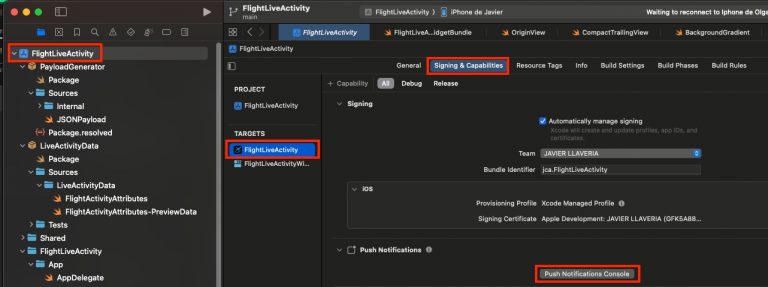
    Go to the Signing & Capabilities tab of your iOS app target and enable the Push Notifications capability.

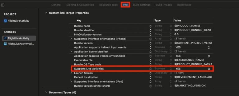
    We need this because Live Activity state changes are triggered by push notifications. Next, update the Info.plist to support Live Activities:

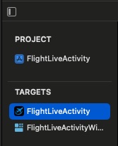
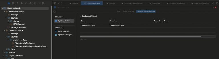
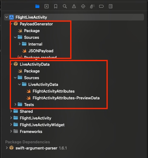
    Regarding Widget Extension Target, no extra setup is required. When we review project explorer we will face 2 packages:

    Payload Generator is a small command-line tool that prints JSON payloads to the console, ready to be pasted directly into the push notifications console. LiveActivityData contains all data structures (and sample data) related to Live Activities. Including them in a package allows the module to be imported by the iOS app, the Widget Extension, and the Payload Generator

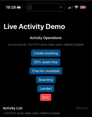
    Up to this point is all you need to know about the project, deploy the app on a real device:

    Screenshot

    In addition to handling Live Activity state changes through push notifications, we’ll also manage them internally from the app itself by triggering updates with a button.

    Create Booking

    For creating a new booking, we will create internally from the app just pressing the corresponding button. The app follows MVVM architecture pattern and the method for handling that in the View Model is following:

        func startActivity(initialState: FlightActivityAttributes.ContentState) {
            let attrs = FlightActivityAttributes.bookingActivity
            let content = ActivityContent(state: initialState, staleDate: nil)
    
            do {
                currentActivity = try Activity.request(
                    attributes: attrs,
                    content: content,
                    pushType: .token
                )
                refreshActivities()
            } catch {
                logger.error("Failed to start activity: \(error.localizedDescription, privacy: .public)")
            }
        }

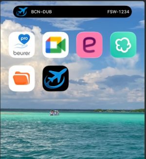
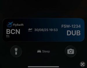
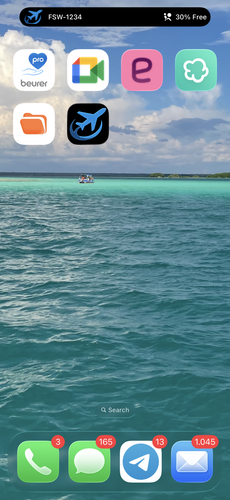
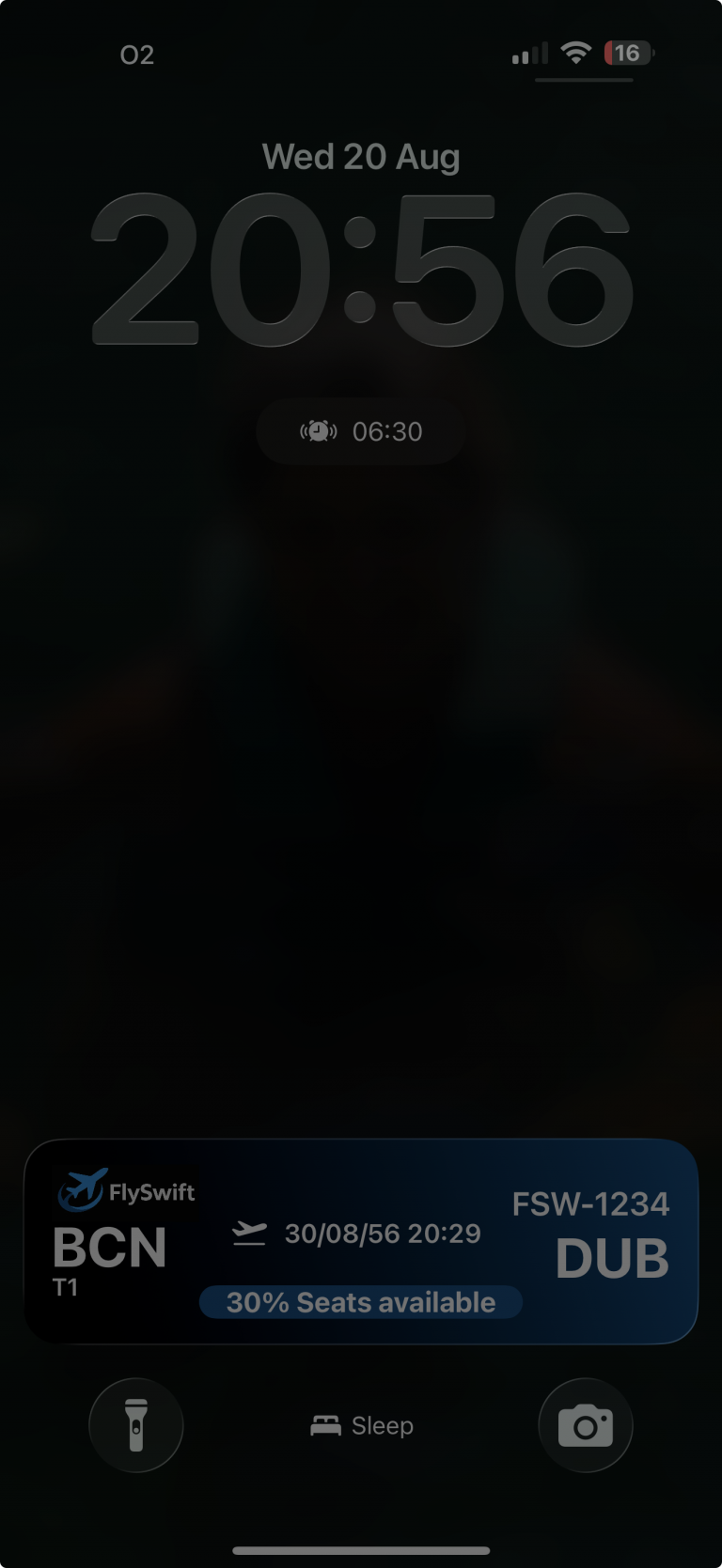
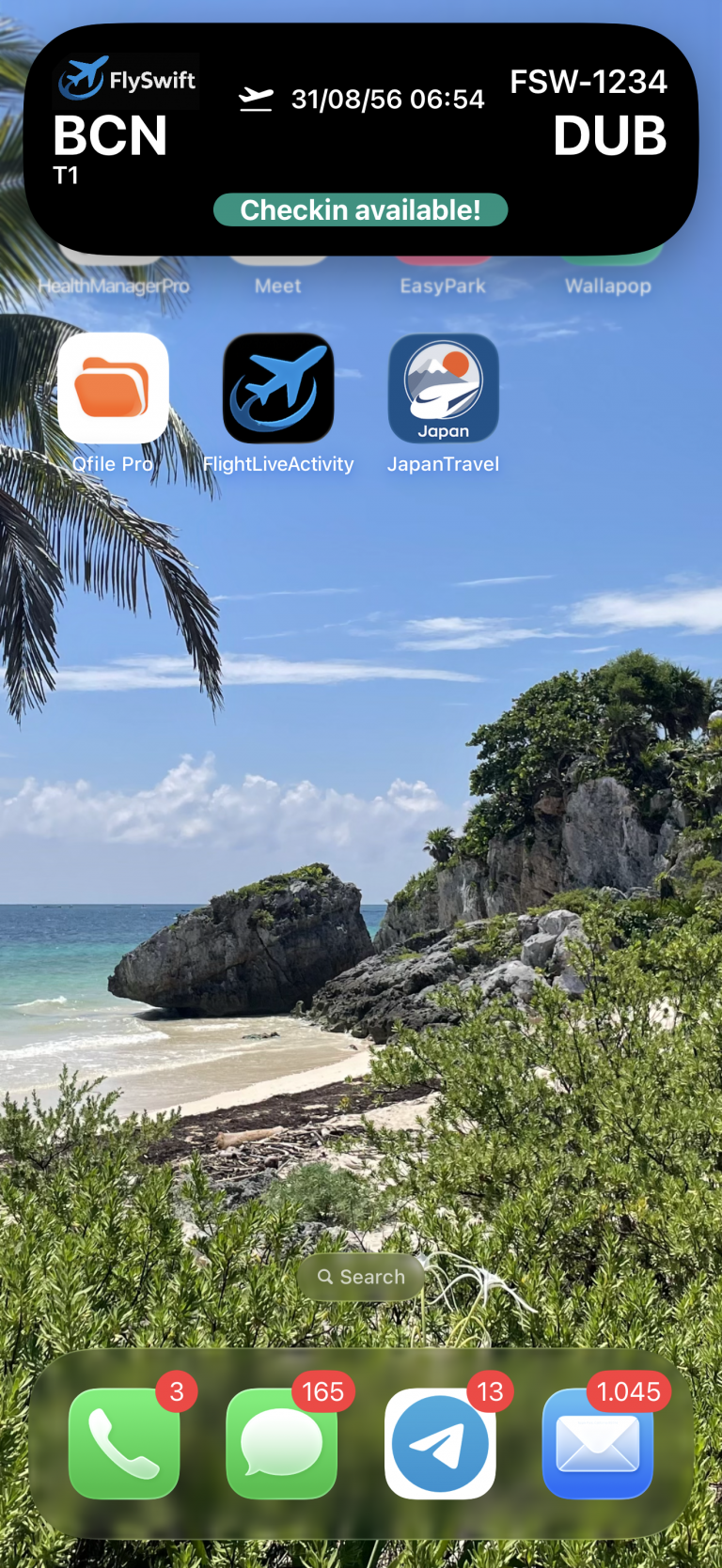
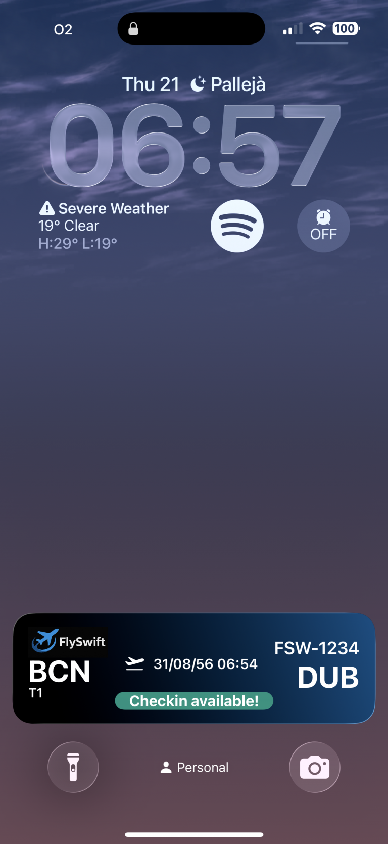
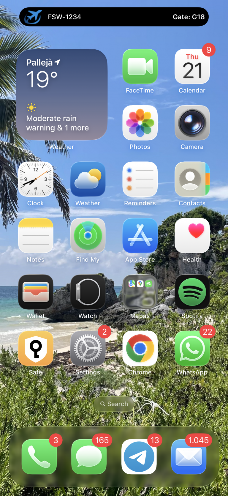
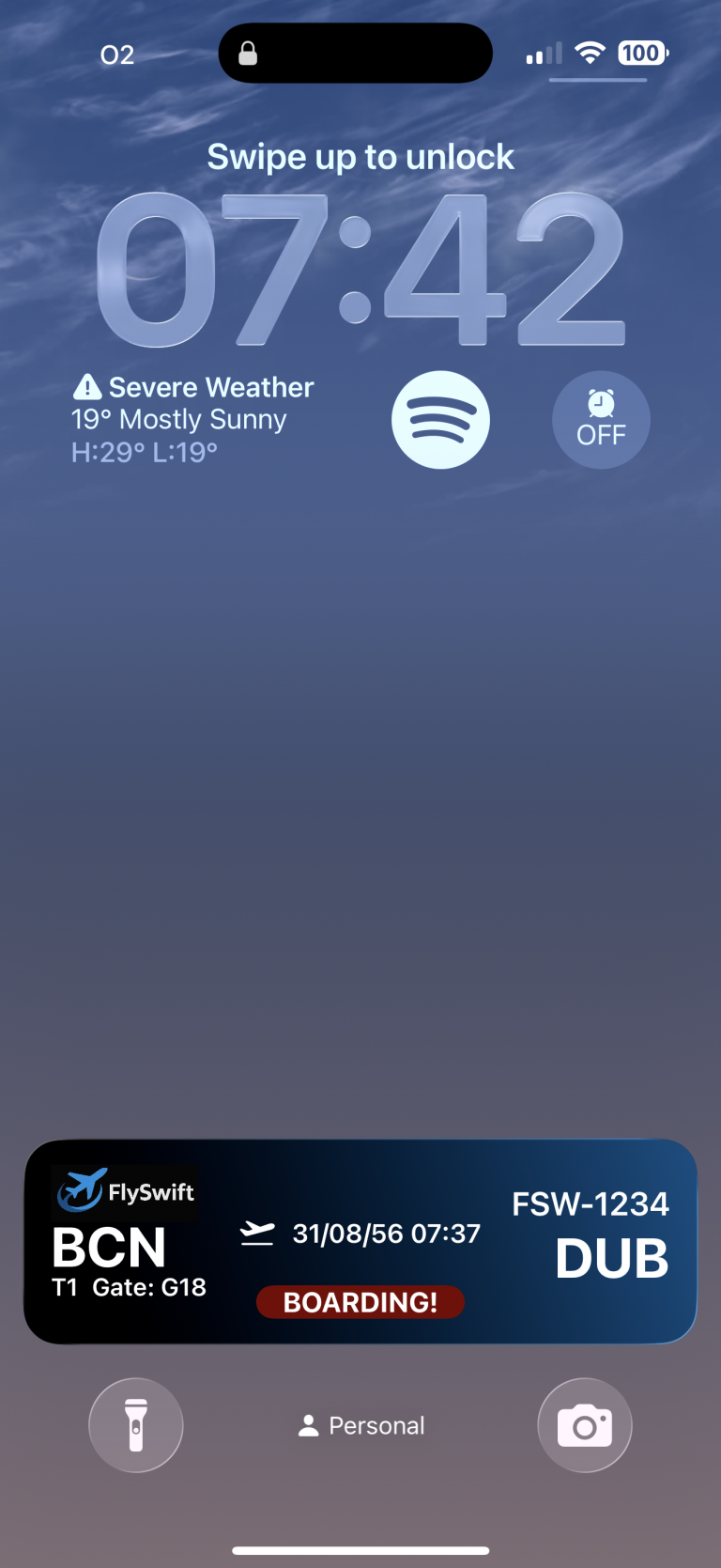
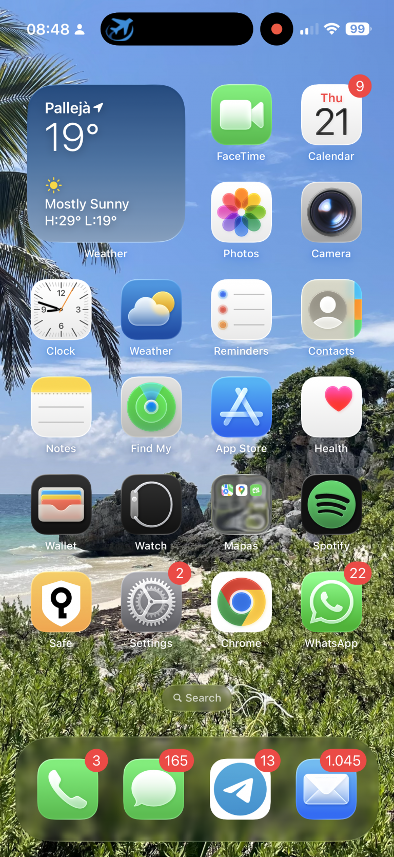
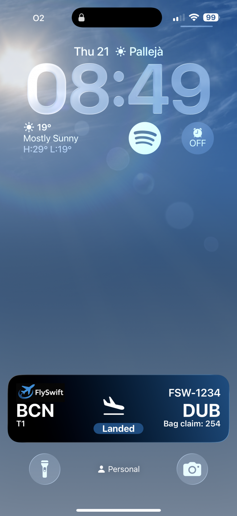
    If we move out from the app we will see dynamic island (left) and block screen (right) presenting a Widget with following content:

    Screenshot
    Screenshot

    Running out of seats

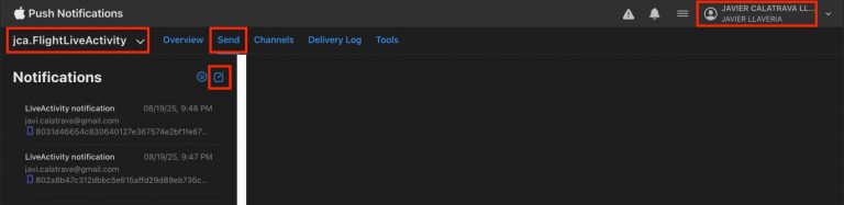
    To let our customers know about seat availability for their booking, we’ll send a push notification to the app with the updated seat information. The first step is to open the Push Notifications console:

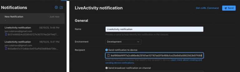
    Log in with your Apple Developer account and open the Push Notifications dashboard. Verify that you’ve selected the correct team and Bundle ID, then click Send and choose New.

    Log in with your Apple Developer account and open the Push Notifications dashboard. Make sure you’ve selected the correct team and Bundle ID. Then click Send and choose New. For Name, enter a descriptive label to help you recognize the purpose of this push notification. Next, under Recipient, paste the last hex code that appeared in the logging console.

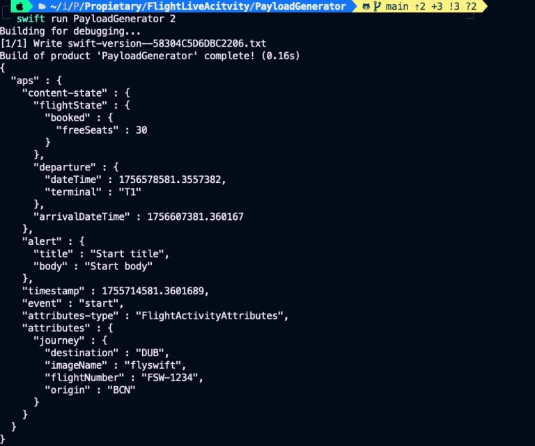
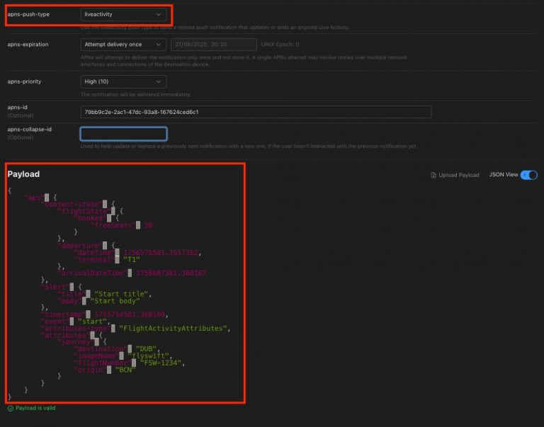
    To generate the JSON payload for the push notification, we’ll use our command-line tool. Run the following command:

    $swift run PayloadGenerator 2

    Here, 2 generates a sample template showing 30% of the available seats.»

    On apns-push-type select liveactivity and paste previous generated download on payload:

    Press the Send button, and you’ll see the following content displayed on the device—both in the Dynamic Island and on the Lock Screen widget:»

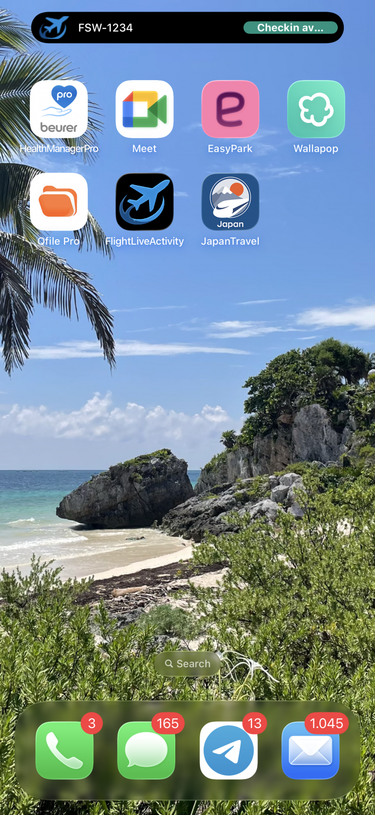
    Checkin available

    A few weeks before a flight departs, airlines usually allow users to check in online. To generate the payload for this scenario, run:

    $swift run PayloadGenerator 3

    Here, 3 generates a sample template that enables the user to perform online check-in. In the Push Notifications dashboard, update the token, paste the payload, and send the notification. You should then see the following:

    When a push notification arrives, the Dynamic Island first appears in compact mode (left). If the user taps it, the Dynamic Island expands (center), and finally the widget is shown (right) when user blocks device. Notice that the widget displays a gradient background, while the Dynamic Island does not—this is because the Dynamic Island is designed to cover the area where the camera and sensors are physically located on the device screen.

    It’s important that the widget and the expanded Dynamic Island share the same composition to ensure maintainability and to simplify the addition or removal of new states. WidgeKit facilitates it by allowin developer implement it on the same class:

    struct BookingFlightLiveActivity: Widget {
        var body: some WidgetConfiguration {
            ActivityConfiguration(for: FlightActivityAttributes.self) { context in
                let attrs = context.attributes
                let state = context.state
    
                FlightWidgetView(attrs: attrs, state: state)
    
            } dynamicIsland: { context in
                let journey = context.attributes.journey
                let state = context.state
    
                return DynamicIsland {
                    DynamicIslandExpandedRegion(.leading) {
                        OriginView(
                            imageName: journey.imageName,
                            origin: journey.origin,
                            departure: state.departure,
                            flightState: state.flightState
                        )
                    }
    
                    DynamicIslandExpandedRegion(.trailing) {
                        DestinationView(
                            flightNumber: journey.flightNumber,
                            destination: journey.destination,
                            arrivalDateTime: state.arrivalDateTime,
                            flightState: state.flightState
                        )
                    }
    
                    DynamicIslandExpandedRegion(.center) {
                        CentralView(
                            departure: state.departure,
                            flightState: state.flightState
                        )
                    }
    
                    DynamicIslandExpandedRegion(.bottom) {
                        ExtraView(flightState: state.flightState)
                    }
                } compactLeading: {
                    CompactLeadingView(
                        origin: journey.origin,
                        destination: journey.destination,
                        flightNumber: journey.flightNumber,
                        flightState: state.flightState
                    )
                } compactTrailing: {
                    CompactTrailingView(
                        flightNumber: journey.flightNumber,
                        flightState: state.flightState
                    )
                } minimal: {
                    MinimalView()
                }
            }
            .supplementalActivityFamilies([.small, .medium])
        }
    }

    This Swift code defines a Live Activity widget called BookingFlightLiveActivity for an iOS flight booking app. It uses ActivityConfiguration to display real-time flight information on the Lock Screen and within the Dynamic Island. On the Lock Screen (FlightWidgetView), it shows booking attributes and state (such as departure, arrival, and flight status). For the Dynamic Island, it customizes different regions: the leading side shows the origin airport, the trailing side shows destination details, the center highlights departure and status, and the bottom provides extra information. It also specifies how the widget appears in compact leading, compact trailing, and minimal Dynamic Island modes. Additionally, it declares support for extra widget sizes (.small and .medium) through supplementalActivityFamilies; for example, .small is used to present the widget on Apple Watch.

    Another important detail is the context, which holds the presentation data. This is divided into two groups: attributes, which are fixed values (such as journey details), and state, which contains variable information that changes as the Live Activity progresses.

    Boarding

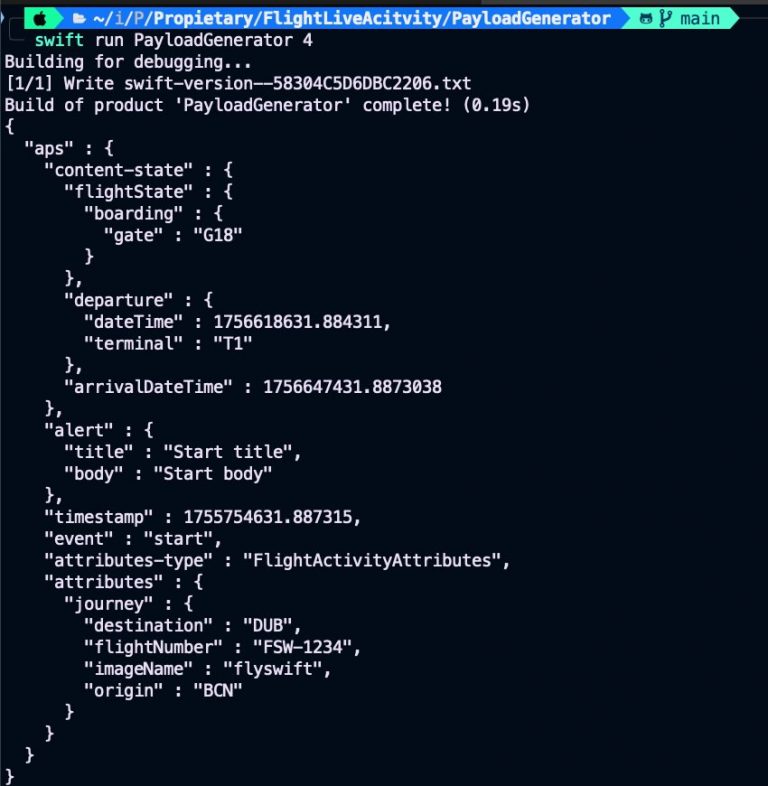
    Now, it gets time of boarding. At this stage we’re going to take a look at the command line tool that we have also developed and facilitates work for generating JSON payload for push notification. To generate the payload for this scenario, run:

    $swift run PayloadGenerator 4

    Here, 4 generates a sample payload template that enables the user be informed about the boarding gate.

    JSONPaload command line tool just parses input atttirbutes and executes its function associated:

    import ArgumentParser
    
    @main
    struct JSONPayload: ParsableCommand {
        @Argument(help: "Which step of the live activity cycle to generate as JSON")
        var step: Int
    
        @Flag(help: "Prints date in a human-readable style")
        var debug: Bool = false
    
        mutating func run() throws {
            let jsonString = switch step {
            case 1: try bookedFlight(debug: debug)
            case 2: try bookedFlight30Available(debug: debug)
            case 3: try checkinAvailable(debug: debug)
            case 4: try boarding(debug: debug)
            case 5: try landed(debug: debug)
            default:
                fatalError("No step '\(step)' defined")
            }
            print(jsonString)
        }
    }

    JSONPaload command line tool just parses input atttirbutes and executes its function associated:

    func boarding(debug: Bool) throws -> String {
        let contentState = FlightActivityAttributes.ContentState.boarding
        let push = PushPayload(
            aps: StartApsContent(
                contentState: contentState,
                attributesType: "FlightActivityAttributes",
                attributes: FlightActivityAttributes.bookingActivity
            )
        )
        let data = try JSONEncoder.pushDecoder(debug: debug).encode(push)
        return try data.prettyPrintedJSONString
    }

    FlightActivityAttributes.ContentState.boarding is same sample data code used also in the app (and widget). Is packaged into LiveActivityData because in that way allows data structure being used by command line tool. This is how PayloadGenerator/Package file declare its dependency with LiveActivityData package:

    import PackageDescription
    
    let package = Package(
        name: "PayloadGenerator",
        platforms: [.macOS(.v15)],
        dependencies: [
            .package(url: "https://github.com/apple/swift-argument-parser.git", from: "1.2.0"),
            .package(path: "../LiveActivityData"),
        ],
        targets: [
            // Targets are the basic building blocks of a package, defining a module or a test suite.
            // Targets can depend on other targets in this package and products from dependencies.
            .executableTarget(
                name: "PayloadGenerator",
                dependencies: [
                    .product(name: "ArgumentParser", package: "swift-argument-parser"),
                    .product(name: "LiveActivityData", package: "LiveActivityData"),
                ]
            ),
        ]
    )
    

    And this is how is set this dependency on iOS app:

    Add package dependency to project, and the import  dependency at time of coding

    ...
    import LiveActivityData
    
    // MARK: - View
    
    struct BookingBoardView: View {
        @StateObject private var controller = BookingBoardViewModel()
    ...

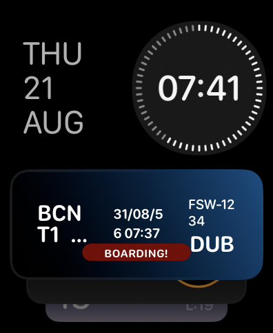
    After sending notification user should have to see in device and also in Apple Watch following:

    Landing

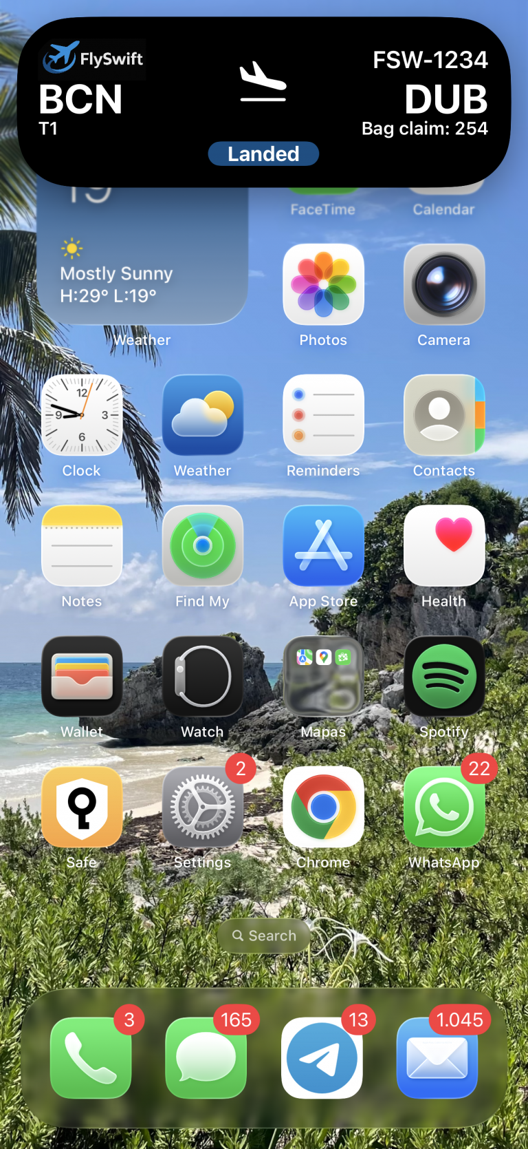
    Your Live Activity for a flight reservation isn’t the only one running on the iOS device. In the following screen sequence, you can see that while a screen recording Live Activity is active, a push notification arrives with updated flight landing information.

    When the push notification arrives, the Dynamic Island first presents it in expanded mode, but shortly after it switches to minimal mode (showing only the app icon). iOS itself decides the order and priority in which multiple Live Activities are presented.

    ...
    struct BookingFlightLiveActivity: Widget {
        var body: some WidgetConfiguration {
            ActivityConfiguration(for: FlightActivityAttributes.self) { context in
    ...
            } dynamicIsland: { context in
    ...
                return DynamicIsland {
                    ...
                } compactLeading: {
    ...
                } compactTrailing: {
    ...
                } minimal: {
                    MinimalView()
                }
            }
            .supplementalActivityFamilies([.small, .medium])
        }
    }

    When reviewing the Widget and Dynamic Island implementation, we can see that there is a section dedicated to defining the minimal view.

    Conclusions

    Implementing Live Activities in an iOS app enhances user experience by providing real-time, glanceable updates on the Lock Screen and Dynamic Island for ongoing, time-sensitive tasks like deliveries, rides, workouts,  live scores or your next flight information. Unlike notifications, which can clutter, Live Activities consolidate progress into a single, dynamic view, keeping users engaged without requiring repeated app opens. They complement widgets by handling short-lived, frequently changing processes while widgets cover persistent summaries. This leads to higher engagement, reduced notification fatigue, improved transparency, and stronger brand presence at high-attention moments—all while offering users quick actions and continuity across app surfaces.

    You can find source code that we have used for conducting this post in following GitHub repository.

    References

  • New Icon Composer with XCode 26

    New Icon Composer with XCode 26

    I’m going to walk you through how to use our new tool, Icon Composer—now integrated into the beta release of Xcode 26—to help you design app icons that feel right at home on iPhone, iPad, Mac, and Apple Watch.

    Tools Required

    Photopea (photopea.com) is a free, web-based alternative to Adobe Photoshop. I used it to design the initial layout of the icon.


    Icon Composer is Apple’s new tool for designers and developers, designed to simplify the process of building app icons for multiple platforms and appearance modes, including light and dark. You can download it from Apple Developer Resources.


    Xcode 26 (currently in beta) is the only version of Xcode that supports the new icon format. I used it to integrate the generated icon into a brand-new app project. You can download it from Apple Developer Resources.

    Icon design

    I’m planning to migrate the icon from my beloved Emom Timers app as soon as iOS 26 is released. Using Photopea, I’ve created a composition to visualize how the layers in the new icon will look.

    Screenshot

    The canvas is set to 1024 × 1024, and only the monochrome layered images are needed—colors and gradients will be handled later by Icon Composer. The next step is to export the layers as .png files. To do this, go to File (Archivo) > Export Layers (Exportar capas…).

    Icon Composer

    Once Icon Composer has been properly installed, just open it:

    Screenshot

    Then, drag the layered .png files previously generated with Photopea.

    Screenshot

    The interface is very intuitive. On the left panel, you’ll see the layers; in the center, the icon composition with controls that let you toggle layer guides and light effects at the top. At the bottom, you can preview how the icon will appear on iOS, macOS, or Apple Watch, including in light, dark, and monochrome modes. The right panel is dedicated to applying colors, blending modes, and the liquid crystal effect.

    Screenshot

    Once all the work is done, don’t forget to save the icon, as we’ll need it in the next step.

    Integrating on XCode 26

    Xcode 26 is the first IDE to support icons created with Icon Composer, so make sure it’s properly installed. Then, create a new iOS project and drag the previously generated Icon Composer file into your project’s source folder:

    Screenshot

    Icon Composer is also integrated into Xcode, so for future changes to the icon, you can open it directly from there. The icon is already included in the project source, but the target is not yet configured to use the new icon.

    Screenshot

    Now deploy the app to a device to see how the icon looks.

    Conclusions

    Icon Composer represents a significant step forward in creating and maintaining app icons. This tool allows designers (and developers) to easily preview how an icon will look across all platforms and appearance modes.

    You can find source code that we have used for conducting this post in following GitHub repository.

    References

  • Interaction and Media Accessibility in iOS

    Interaction and Media Accessibility in iOS

    Accessibility in iOS apps goes beyond just visual elements—it also includes interaction and media. In this post, we’ll focus on interaction and media-related accessibility topics, completing our coverage of accessibility in iOS 17.

    As we go through the post, I’ll share a sample project and source code to illustrate the key concepts.

    This post is a continuation of our previous article on visual accessibility in iOS.

    Voice Control

    Voice Control accessibility belongs to Ineraction group and is a feature that allows users to navigate and interact with their device entirely through spoken commands, without needing to touch the screen. It enables control over system-wide functions and app interfaces, such as tapping buttons, swiping, typing, dictating text, and navigating menus using voice instructions. Designed for users with limited mobility, Voice Control works by recognizing labels, accessibility identifiers, and numbered overlays on screen elements, making it essential for developers to provide clear and descriptive accessibility metadata in their apps to ensure seamless and inclusive user experiences.

    We will start by conding following chunk:

    struct VoiceControlView: View {
        @State private var name: String = ""
        @State private var message: String = ""
    
        var body: some View {
            VStack(spacing: 20) {
                Text("Voice Control Example")
                    .font(.title)
                    .accessibilityAddTraits(.isHeader)
                
                TextField("Enter your name", text: $name)
                    .textFieldStyle(RoundedBorderTextFieldStyle())
                    .padding()
                    .accessibilityLabel("Name Field")
                    .accessibilityIdentifier("nameField")
    
                Button(action: {
                    message = "Hello, \(name)!"
                }) {
                    Text("Submit")
                        .padding()
                        .frame(maxWidth: .infinity)
                        .background(Color.blue)
                        .foregroundColor(.white)
                        .cornerRadius(10)
                }
                .accessibilityLabel("Submit Button")
                .accessibilityIdentifier("submitButton")
    
                if !message.isEmpty {
                    Text(message)
                        .font(.headline)
                        .accessibilityLabel(message)
                }
    
                Spacer()
            }
            .padding()
        }
    }

    This SwiftUI code defines a simple view called VoiceControlView that demonstrates how to make an interface accessible using iOS Voice Control. It includes a title, a text field for entering a name, and a submit button that, when tapped (or activated by voice), displays a personalized greeting message. Accessibility labels and identifiers are provided for the text field and button, allowing users to interact with them using voice commands like «Tap Name Field» or «Tap Submit Button.» The view is designed to be fully accessible, enhancing usability for users who rely on voice input for navigation and interaction.

    For a more realistic experience, I recommend running the demo on a real device. Note that Voice Control is not enabled by default—you’ll need to turn it on by going to Settings > Accessibility > Voice Control.

    Screenshot
    Screenshot 2025-07-26 at 20.43.11

    Deploy the app in a real device, and if Voice Control was setup properly, you should have to see following:

    Screenshot 2025-07-26 at 20.57.13
    Screenshot 2025-07-26 at 20.56.05

    Instead of tapping controls on the device screen, simply say «Tap» followed by the label shown on the control you want to interact with. For example, say «Tap More» to access the view dedicated to Voice Control, «Tap Name» to start entering text into the input field, and «Tap Submit» to submit the form.

    Voice Over

    VoiceOver belongs to Ineraction group and is an iOS accessibility feature that provides spoken feedback to help users with visual impairments navigate and interact with their devices. It reads aloud on-screen elements such as buttons, labels, text, and images, and allows users to control their device using gestures tailored for non-visual interaction. When VoiceOver is enabled, users can explore the interface by dragging a finger across the screen or using swipe gestures to move between elements, with each item being read aloud. Developers can enhance VoiceOver support by providing descriptive accessibility labels, traits, and hints to ensure that all content is understandable and usable without relying on sight.

    Lets take a look at the code  prepared for voice over:

    struct VoiceOverView: View {
        @State private var isToggled = false
           
           var body: some View {
               VStack(spacing: 40) {
                   Text("VoiceOver Interaction Example")
                       .font(.title)
                       .accessibilityAddTraits(.isHeader)
                   
                   Button(action: {
                       isToggled.toggle()
                   }) {
                       Image(systemName: isToggled ? "checkmark.circle.fill" : "circle")
                           .resizable()
                           .frame(width: 60, height: 60)
                           .foregroundColor(isToggled ? .green : .gray)
                   }
                   .accessibilityLabel("Toggle button")
                   .accessibilityValue(isToggled ? "On" : "Off")
                   .accessibilityHint("Double tap to change the toggle state")
    
                   Text("Toggle is currently \(isToggled ? "On" : "Off")")
               }
               .padding()
           }
    }

    The VoiceOverView SwiftUI struct defines a user interface that includes a header, a toggle button represented by an icon, and a status text label, with full VoiceOver accessibility support. The toggle button switches between a green checkmark and a gray circle when tapped, reflecting its «On» or «Off» state. For VoiceOver users, the button is described as «Toggle button» with a dynamic accessibility value («On» or «Off») and a hint explaining that a double-tap changes its state. The header is marked with .isHeader to assist navigation, and the toggle state is also shown in plain text. This setup ensures visually impaired users can fully interact with and understand the UI using VoiceOver.

    Deploy in the simulator and present the screen to audit and open Accesibility Inspector, select simulator and Run Audit:

    Captions

    Captions belong to the Media Accessibility group and consist of providing text descriptions of dialogue and other audible content during media playback. They help people who are deaf or hard of hearing access important information such as speech, nonverbal communication, music, and sound effects. Ensure that users can enable captions for all video or audio content. In this case, there is nothing to code—just make sure that if your app plays video, the content includes the option to enable captions (speech, non-verbal communication, music or sound effects).

    Audio descriptions

    Audio Descriptions belong to the Media Accessibility group and provide spoken narration during natural pauses in the main audio to describe important visual elements of the content. This helps people who are blind or have low vision understand what is happening on screen. Make sure users can easily find content that includes audio descriptions. For example, most video streaming apps display an «AD» icon to indicate availability. As with captions, this accessibility requirement applies to the content being played—not the app itself.

    Conclusions

    With this post, we wrap up the remaining accessibility groups—Interaction and Media—that we set aside in a previous post. The Interaction group includes coding tasks that require implementation, while the Media group mainly concerns the accessibility of streamed content within the app, so there’s typically nothing to code.

    You can find source code that we have used for conducting this post in following GitHub repository.

    References

  • Visual Accessibilty in iOS

    Visual Accessibilty in iOS

    Accessibility in iOS apps is a powerful way to highlight the importance of inclusive design while showcasing the robust accessibility tools Apple provides, such as VoiceOver, Dynamic Type, and Switch Control. It not only helps fellow developers understand how to create apps that are usable by everyone, including people with disabilities, but also demonstrates professionalism, empathy, and technical depth. By promoting best practices and raising awareness.

    For this post, we will focus only on visual accessibility aspects. Interaction and media-related topics will be covered in a future post. As we go through this post, I will also provide the project along with the source code used to explain the concepts.

    Accessibility Nutrition Labels

    Accessibility Nutrition Labels in iOS are a developer-driven concept inspired by food nutrition labels, designed to provide a clear, standardized summary of an app’s accessibility features. They help users quickly understand which accessibility tools—such as VoiceOver, Dynamic Type, or Switch Control—are supported, partially supported, or missing, making it easier for individuals with disabilities to choose apps that meet their needs. Though not a native iOS feature, these labels are often included in app. Eventhought accessibility is supported in almost all Apple platforms, some accessibility labels aren’t available check here.

    They can be set at the moment that you upload a new app version on Apple Store.

    Sufficient contrast

    Users can increase or adjust the contrast between text or icons and the background to improve readability. Adequate contrast benefits users with reduced vision due to a disability or temporary condition (e.g., glare from bright sunlight). You can indicate that your app supports “Sufficient Contrast” if its user interface for performing common tasks—including text, buttons, and other controls—meets general contrast guidelines (typically, most text elements should have a contrast ratio of at least 4.5:1). If your app does not meet this minimum contrast ratio by default, it should offer users the ability to customize it according to their needs, either by enabling a high-contrast mode or by applying your own high-contrast color palettes. If your app supports dark mode, be sure to check that the minimum contrast ratio is met in both light and dark modes.

     We have prepared following  following screen, that clearly does not follow this nutrition label:

    Deploy in the simulator and present the screen to audit and open Accesibility Inspector:

    Screenshot

    Deploy in the simulator and present the screen to audit and open Accesibility Inspector, select simulator and Run Audit:

    Important point, only are audited visible view layers:

    Buid and run on a simulator for cheking that all is working fine:

    Dark mode

    Dark Mode in SwiftUI is a user interface style that uses a darker color palette to reduce eye strain and improve visibility in low-light environments. SwiftUI automatically supports Dark Mode by adapting system colors like .primary, .background, and .label based on the user’s system settings. You can customize your UI to respond to Dark Mode using the @Environment(\.colorScheme) property.

    Simulator Screenshot - iPhone 16 Pro - 2025-07-19 at 08.43.32
    Simulator Screenshot - iPhone 16 Pro - 2025-07-19 at 08.43.41

    We’ve designed our app to support Dark Mode, but to ensure full compatibility, we’ll walk through some common tasks. We’ll also test the app with Smart Invert enabled—an accessibility feature that reverses interface colors.

    Simulator Screenshot - iPhone 16 Pro - 2025-07-19 at 12.24.42
    Simulator Screenshot - iPhone 16 Pro - 2025-07-19 at 12.25.15

    Once smart invert is activated all colors are set in their oposite color. This is something that we to have to avoid in some components of our app such as images.

                        AsyncImage(url: URL(string: "https://www.barcelo.com/guia-turismo/wp-content/uploads/2022/10/yakarta-monte-bromo-pal.jpg")) { image in
                             image
                                 .resizable()
                                 .scaledToFit()
                                 .frame(width: 300, height: 200)
                                 .cornerRadius(12)
                                 .shadow(radius: 10)
                         } placeholder: {
                             ProgressView()
                                 .frame(width: 300, height: 200)
                         }
                         .accessibilityIgnoresInvertColors(isDarkMode)

    In case of images or videos we have to avoid color inversion, we can make this happen by adding accessibilityIgnoreInvertColors modifier.

    Simulator Screenshot - iPhone 16 Pro - 2025-07-19 at 08.43.32
    Simulator Screenshot - iPhone 16 Pro - 2025-07-19 at 08.43.41

    It’s important to verify that media elements, like images and videos, aren’t unintentionally inverted. Once we’ve confirmed that our app maintains a predominantly dark background, we can confidently include Dark Interface in our Accessibility Nutrition Labels.

    Larger Text

    In Swift, «Larger Text» under Accessibility refers to iOS’s Dynamic Type system, which allows users to increase text size across apps for better readability. When building a nutrition label UI, developers should support these settings by using Dynamic Type-compatible fonts (like .body, .title, etc.), enabling automatic font scaling (adjustsFontForContentSizeCategory in UIKit or .dynamicTypeSize(...) in SwiftUI), and ensuring layouts adapt properly to larger sizes. This ensures the nutrition label remains readable and accessible to users with visual impairments, complying with best practices for inclusive app design.

    You can increase dynamic type in simulator in two ways, first one is by using accesibilty inspector, second one is by opening device Settings, Accessibilty, Display & Text Size, Larger text:

    Simulator Screenshot - iPhone 16 Pro - 2025-07-19 at 13.00.31

    When se set the text to largest size we observe following:

    simulator_screenshot_F5937212-D584-449C-AE40-BFE3BEE486A3

    Only navigation title is being resized the rest of the content keeps the same size, this is not so much accessible!.

    When we execute accesibilty inspectoron this screen also complains.

    By replacing fixed font size by the type of font (.largeTitle, .title, .title2, .title3, .headline, .subheadline, .body, .callout, .footnote and .caption ). Remve also any frame fixed size that could cut any contained text. 

     func contentAccessible() -> some View {
            VStack(alignment: .leading, spacing: 8) {
                Text("Nutrition Facts")
                    .font(.title)
                    .bold()
                    .accessibilityAddTraits(.isHeader)
    
                Divider()
    
                HStack {
                    Text("Calories")
                        .font(.body)
                    Spacer()
                    Text("200")
                        .font(.body)
                }
    
                HStack {
                    Text("Total Fat")
                        .font(.body)
                    Spacer()
                    Text("8g")
                        .font(.body)
                }
    
                HStack {
                    Text("Sodium")
                        .font(.body)
                    Spacer()
                    Text("150mg")
                        .font(.body)
                }
            }
            .padding()
            .navigationTitle("Larger Text")
        }
    simulator_screenshot_80105F6D-0B6A-4899-ACEF-4CE44221E330

    We can observe how the view behaves when Dynamic Type is adjusted from the minimum to the maximum size. Notice that when the text «Nutrition Facts» no longer fits horizontally, it wraps onto two lines. The device is limited in horizontal space, but never vertically, as vertical overflow is handled by implementing a scroll view.

    Differentiate without color alone

    Let’s discuss color in design. It’s important to remember that not everyone perceives color the same way. Many apps rely on color—like red for errors or green for success—to convey status or meaning. However, users with color blindness might not be able to distinguish these cues. To ensure accessibility, always pair color with additional elements such as icons or text to communicate important information clearly to all users.

    Accessibility inspector, and also any color blinded person, will complain. For fixing use any shape or icon, apart from the color.l

    Simulator Screenshot - iPhone 16 Pro - 2025-07-19 at 16.59.40
    Simulator Screenshot - iPhone 16 Pro - 2025-07-19 at 16.59.46

    Reduced motion

    Motion can enhance the user experience of an app. However, certain types of motion—such as zooming, rotating, or peripheral movement—can cause dizziness or nausea for people with vestibular sensitivity. If your app includes these kinds of motion effects, make them optional or provide alternative animations.

    Lets review the code:

    struct ReducedMotionView: View {
        @Environment(\.accessibilityReduceMotion) var reduceMotion
        @State private var spin = false
        @State private var scale: CGFloat = 1.0
        @State private var moveOffset: CGFloat = -200
    
        var body: some View {
            NavigationView {
                ZStack {
                    // Background rotating spiral
                    Circle()
                        .strokeBorder(Color.purple, lineWidth: 10)
                        .frame(width: 300, height: 300)
                        .rotationEffect(.degrees(spin ? 360 : 0))
                        .animation(reduceMotion ? nil : .linear(duration: 3).repeatForever(autoreverses: false), value: spin)
    
                    // Scaling and bouncing circle
                    Circle()
                        .fill(Color.orange)
                        .frame(width: 100, height: 100)
                        .scaleEffect(scale)
                        .offset(x: reduceMotion ? 0 : moveOffset)
                        .animation(reduceMotion ? nil : .easeInOut(duration: 1).repeatForever(autoreverses: true), value: scale)
                }
                .onAppear {
                    if !reduceMotion {
                        spin = true
                        scale = 1.5
                        moveOffset = 200
                    }
                }
                .padding()
                .overlay(
                    Text(reduceMotion ? "Reduce Motion Enabled" : "Extreme Motion Enabled")
                        .font(.headline)
                        .padding()
                        .background(Color.black.opacity(0.7))
                        .foregroundColor(.white)
                        .cornerRadius(12)
                        .padding(),
                    alignment: .top
                )
            }
            .navigationTitle("Reduced motion")
        }
    }

    The ReducedMotionView SwiftUI view creates a visual demonstration of motion effects that adapts based on the user’s accessibility setting for reduced motion. It displays a rotating purple spiral in the background and an orange circle in the foreground that scales and moves horizontally. When the user has Reduce Motion disabled, the spiral continuously rotates and the orange circle animates back and forth while scaling; when Reduce Motion is enabled, all animations are disabled and the shapes remain static. A label at the top dynamically indicates whether motion effects are enabled or reduced, providing a clear visual contrast for accessibility testing.

    Reduce Motion accessibility is not about removing animations from your app, but disable them when user has disabled Reduce Motion device setting.


    Pending

    Yes, this post is not complete yet. There are two families of Nutrition accessibility labels: Interaction and Media. I will cover them in a future post.

    Conclusions

    Apart from the benefits that accessibility provides to a significant group of people, let’s not forget that disabilities are diverse, and as we grow older, sooner or later we will likely need to use accessibility features ourselves. Even people without disabilities may, at some point, need to focus on information under challenging conditions—like poor weather—which can make interaction more difficult. It’s clear that this will affect us as iOS developers in how we design and implement user interfaces in our apps.

    You can find source code that we have used for conducting this post in following GitHub repository.

    References

  • Maintain, Share, Repeat: iOS Component Distribution

    Maintain, Share, Repeat: iOS Component Distribution

    Distribute and easily maintain a component is valuable because it addresses a common challenge in scaling and collaborating on iOS projects. By sharing strategies for modularizing code, using Swift Package Manager, applying semantic versioning, and setting up proper documentation and CI/CD workflows, developers can create reusable, testable, and maintainable components that boost productivity across teams.

    Just as important as creating scalable components is defining a solid framework for maintaining and distributing them. In this post, we’ll focus on the infrastructure side of that process.

    The Alert Component

    First step is creating the package that will hold our component by typing following 3 commands:

    $ mkdir AlertComponent
    $ cd AlertComponent
    $ swift package init --type library
    Screenshot

    Once the package scaffold is created, implement the component. In this post, the focus is on distribution, not maintenance or component scalability — which are certainly important and will be covered in future posts.

    import SwiftUI
    
    @available(macOS 10.15, *)
    public struct AlertView: View {
        let title: String
        let message: String
        let dismissText: String
        let onDismiss: () -> Void
    
        public init(title: String, message: String, dismissText: String = "OK", onDismiss: @escaping () -> Void) {
            self.title = title
            self.message = message
            self.dismissText = dismissText
            self.onDismiss = onDismiss
        }
    
        public var body: some View {
            VStack(spacing: 20) {
                Text(title)
                    .font(.headline)
                    .padding(.top)
    
                Text(message)
                    .font(.body)
    
                Button(action: onDismiss) {
                    Text(dismissText)
                        .bold()
                        .frame(maxWidth: .infinity)
                        .padding()
                        .background(Color.blue)
                        .foregroundColor(.white)
                        .cornerRadius(8)
                }
            }
            .padding()
            .background(Color(.white))
            .cornerRadius(16)
            .shadow(radius: 10)
            .padding()
        }
    }
    

    It is a simple alert component. In a future post, we will explore how to improve its maintainability, scalability, and documentation. Most importantly, we will upload the code to a GitHub repository.

    generated

    Consume component

    For consume it this component we are going to create a simple iOS project, but this time via Tuist. Tuist is a powerful yet often underutilized tool that can greatly simplify project setup, modularization, and CI workflows, you can find an introduction to this technology in this post. At the end is clearer to track configuration changes in project by code.


    $ tuist init
    Screenshot

    Next is configuring SPM alert component package on Tuist:

    $ tuist edit

    Go to Project.swif, In packages add package url and version, and also in targets add package dependecy:

    import ProjectDescription
    
    let project = Project(
        name: "AlertComponentConsumer",
        packages: [
            .package(url: "https://github.com/JaCaLla/AlertComponent.git", from: "0.0.1")
        ],
        targets: [
            .target(
                name: "AlertComponentConsumer",
                ...
                dependencies: [
                    .package(product: "AlertComponent")
                ]
            ),
            .target(
                name: "AlertComponentConsumerTests",
              ...
                dependencies: [.target(name: "AlertComponentConsumer")]
            ),
        ]
    )
    

    Run twist generate and build de project for chacking that all is ok.

    $ tuist generate
    Screenshot

    Observe that component has been included as Package dependency:

    Update ContentView.swift for start playing with AlertComponent.

    import SwiftUI
    import AlertComponent
    
    struct ContentView: View {
        @State private var showAlert = false
    
        var body: some View {
            ZStack {
                Button("Show alert") {
                    showAlert = true
                }
    
                if showAlert {
                    AlertView(
                        title: "Warning",
                        message: "This is a personalized alert view",
                        onDismiss: {
                            showAlert = false
                        }
                    )
                    .background(Color.black.opacity(0.4).ignoresSafeArea())
                }
            }
        }
    }

    Buid and run on a simulator for cheking that all is working fine:

    You can find the AlertComponentConsumer iOS project in our GitHub repository.

    Component maintenance

    From now on, we have both the component deployment and the final user component. Component developers not only write the source code, but also need to create a bench test project to properly develop and validate the component. This bench test project is also very useful for final developers, as it serves as documentation on how to integrate the component into their iOS projects.

    This project will be called ‘AlertComponentDemo’ and will be placed in a sibling folder from Alert Componet. This is not casuality because we add component source files to this project as a reference, so comopent developer in the same XCode project will be able to update component and bench test source code.

    We will use also Tuist for generating this project:

    $ tuist init
    Screenshot

    Remember, it is mandatory to know where we place the project folder because we will include component source files as references. In my case, I decided to keep the folder in the same parent directory as the siblings.

    Edit project with Tuist for including component source code references….

    let project = Project(
        name: "AlertComponentBench",
        targets: [
            .target(
                name: "AlertComponentBench",
               ...
                sources: ["AlertComponentBench/Sources/**",
                          "../AlertComponent/Sources/**"],
                ...
    )

    Genertate Xcode project with Tuist

    $ tuist generate
    Screenshot

    For simplicity, we will place the same code in ContentView.swift that we previously used in Consumer to verify that everything is properly integrated and functioning.

    Now the component is easier to maintain because, within the same project, the developer can manage both the component code and the code for starting to work with the component.

    Screenshot

    But code changes keept separately in two different reposiories:

    Screenshot

    This ensures that the component repository contains only the code specific to the component. You can find the AlertComponentBench iOS project in our GitHub repository.

    Component Control Version

    Having a version control is crucial for managing changes, ensuring stability, and supporting safe, modular development. It allows developers to track the evolution of the component, prevent breaking changes through semantic versioning, and let consumers lock to specific versions that are known to work. This setup fosters reliable updates, easier debugging, streamlined collaboration, and consistent integration in both personal and team projects. Ultimately, version control transforms a simple UI component into a maintainable, scalable, and production-ready package.

    As component is placed on GitHub we will implement a GitHub Action that will be triggered every time a pull request merges into main branch

    name: Tag on PR Merge to Main
    
    on:
      pull_request:
        types: [closed]
        branches:
          - main
    
    jobs:
      tag:
        if: github.event.pull_request.merged == true
        runs-on: ubuntu-latest
    
        steps:
          - name: Checkout repo
            uses: actions/checkout@v4
            with:
              fetch-depth: 0  # Needed to fetch tags
    
          - name: Set up Git
            run: |
              git config user.name "GitHub Actions"
              git config user.email "actions@github.com"
    
          - name: Get latest tag
            id: get_tag
            run: |
              latest=$(git describe --tags `git rev-list --tags --max-count=1` 2>/dev/null || echo "v0.0.0")
              echo "Latest tag: $latest"
              echo "tag=$latest" >> $GITHUB_OUTPUT
    
          - name: Determine bump type from PR title
            id: bump
            run: |
              title="${{ github.event.pull_request.title }}"
              echo "PR Title: $title"
              first_word=$(echo "$title" | awk '{print toupper($1)}')
              case $first_word in
                MAJOR)
                  echo "bump=major" >> $GITHUB_OUTPUT
                  ;;
                MINOR)
                  echo "bump=minor" >> $GITHUB_OUTPUT
                  ;;
                *)
                  echo "bump=patch" >> $GITHUB_OUTPUT
                  ;;
              esac
    
          - name: Calculate next version
            id: next_tag
            run: |
              tag="${{ steps.get_tag.outputs.tag }}"
              version="${tag#v}"
              IFS='.' read -r major minor patch <<< "$version"
    
              bump="${{ steps.bump.outputs.bump }}"
              case $bump in
                major)
                  major=$((major + 1))
                  minor=0
                  patch=0
                  ;;
                minor)
                  minor=$((minor + 1))
                  patch=0
                  ;;
                patch)
                  patch=$((patch + 1))
                  ;;
              esac
    
              next_tag="v$major.$minor.$patch"
              echo "Next tag: $next_tag"
              echo "next_tag=$next_tag" >> $GITHUB_OUTPUT
    
          - name: Create and push new tag
            run: |
              git tag ${{ steps.next_tag.outputs.next_tag }}
              git push origin ${{ steps.next_tag.outputs.next_tag }}

    This GitHub Actions workflow automatically creates and pushes a new semantic version tag whenever a pull request is merged into the main branch. It triggers on PR closures targeting main, and only proceeds if the PR was actually merged. It fetches the latest Git tag (defaulting to v0.0.0 if none exist), determines the version bump type based on the first word of the PR title (MAJOR, MINOR, or defaults to patch), calculates the next version accordingly, and pushes the new tag back to the repository. This enables automated versioning tied directly to PR titles.

    Now we are going to introduce some changes in the component.

    Commit changes in a separate branch:

    Prepare pull request:

    Create pull request

    Once you merge it, GitHub action will be executed.

    Let’s pull changes on main branch:

    main branch commit from pr has been tagged!

    Now let’s going to consume new component version, Tuist edit alert component consumer project:

    $ tuist edit
    import ProjectDescription
    
    let project = Project(
        name: "AlertComponentConsumer",
        packages: [
            .package(url: "https://github.com/JaCaLla/AlertComponent.git", from: "0.2.0")
        ],
      ...
    )
    
    $ tuist generate

    Build and deploy on simulator

    Simulator Screenshot - iPhone 16 - 2025-07-13 at 14.00.21

    Documentation

    Last but not least, having good documentation is a great starting point to encourage adoption and ensure a smooth integration process. It’s not about writing a myriad of lines — simply providing a well-written README.md file in the GitHub repository with clear and basic information is enough to help developers start using the component effectively.

    Conclusions

    Developing a component is not enough; it also requires providing a reusable and scalable architecture, along with delivery mechanisms that enable fast distribution and the ability to track which exact version of the component consumers are using.

    References